The second-best lamp for painting miniatures

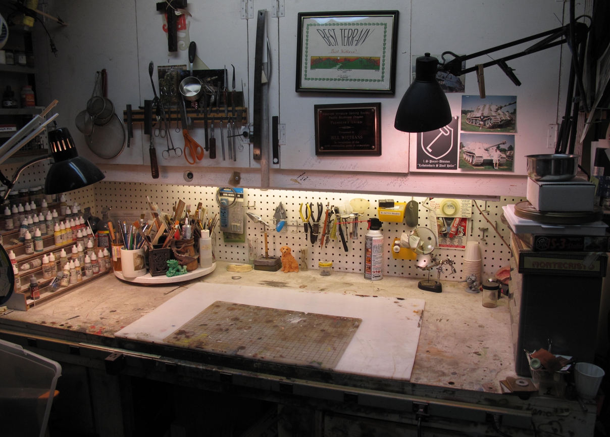
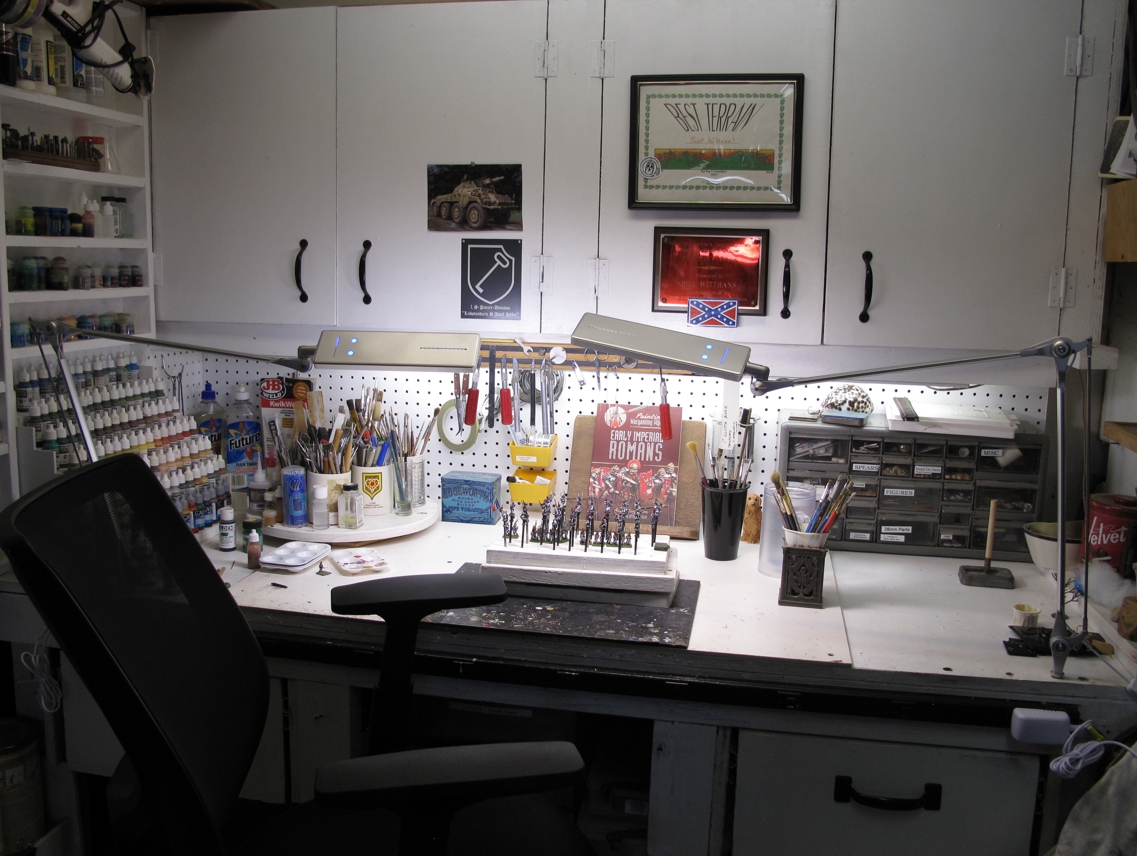
My Workbench about 5 years ago, not bad, looking well used! My old lamps were hot, didn’t have the best output, and never quite reached or stayed where I wanted them.

Over the last couple of years I have been upping my game as far as workbench/workspace when it comes to miniatures painting. Well, this weekend I bought and added the second-best miniature “painting lamp” to my work bench setup! It’s made by BYBLIGHT and is easily the second-best painting light I’ve ever owned!

  • Touch control, no switches to have to twist and go bad. Memory remembers your settings from use to use!
  • 6 level, touch dimmer control
  • Color temperature selection, 3200k, 4200k, 5200k, and 6200k, paint under the right light!
  • Very nice diffused light with changeable diffusion panel.
  • LED’S with 50,000 hours life expectancy with no Flicker of UV on all levels.
  • Low power consumption and generates low heat.
  • Well built arms that get to where you want them and stay there. Fully adjustable lamp head.

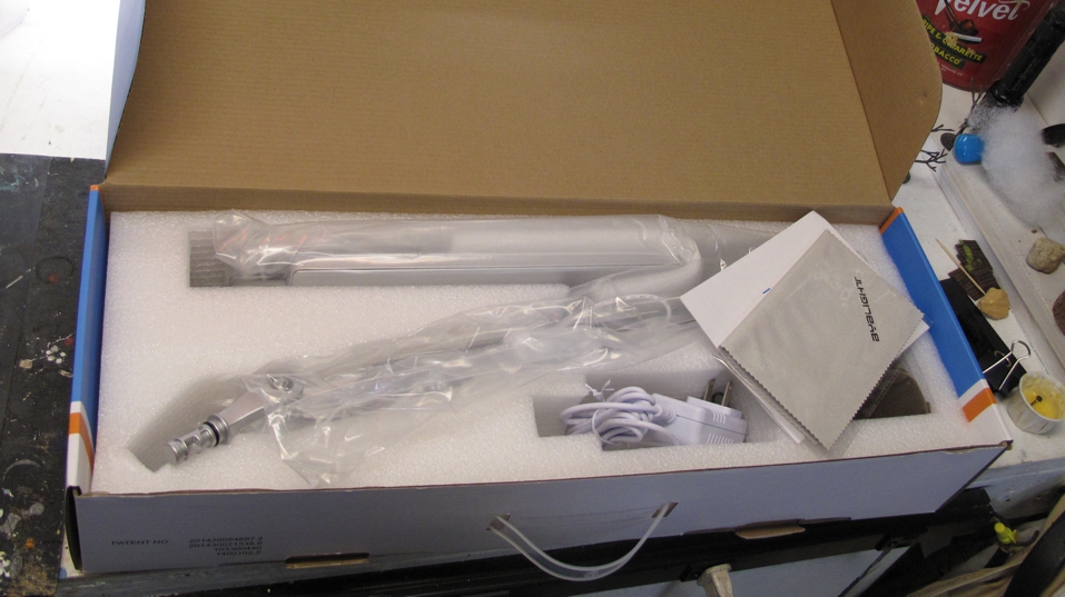
Well made, well packed, and well worth it!

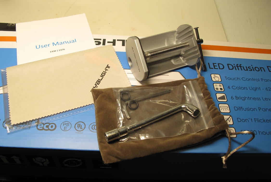
Tools, replacement rubber grommets, clamp, cleaning pad, and instructions, wow!

Add to this the great design and look of this lamp along with great quality in manufacturing makes this lamp a winner! Its not cheap at around $90 bucks but taking into consideration that I’ve gone through 2-3 of the cheaper typical one bulb desk lamps over the years and this one looks to last much longer, it’s not bad! When you add all the above features in and paint with it a few times you wish these would have been around years ago! They also come with a high quality clamp for attaching to a desk, a wrench for tightening loose parts, a cleaning cloth, and a nice bag to keep it all in. There are a few “knock offs” of this lamp, cheaper but not as good! I got one on sale at $86 during the “pandemic” but $96 with free shipping is the best I can find now.

Buy it here;  https://www.amazon.com/BYB-Architect-Eye-care-Drafting-Dimmable/dp/B00V9YW41O

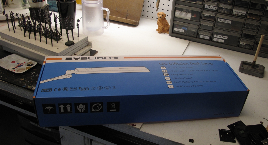
Even the packaging is well done and shows some pride in manufacturing, rare today!

Miniature painting and wargaming is a visual hobby and your eyes are an indispensable tool! We often think about, figures, paints, brushes, and other things more than these most important of all resources! Treat them with care, you only get two, one time, and they have to last a life time. Some of us are getting older and it becomes even more important to have the proper type of light and enough of it!

You may be wondering why it’s “the second-best miniature “painting lamp” and not the first?” well simply because its the second one of these lamps I’ve purchased! The first one was such a joy and for me “the best miniature painting lamp” this one could only be the second!

Yep, a second lamp! Everyone knows that two lamps are better than one!”

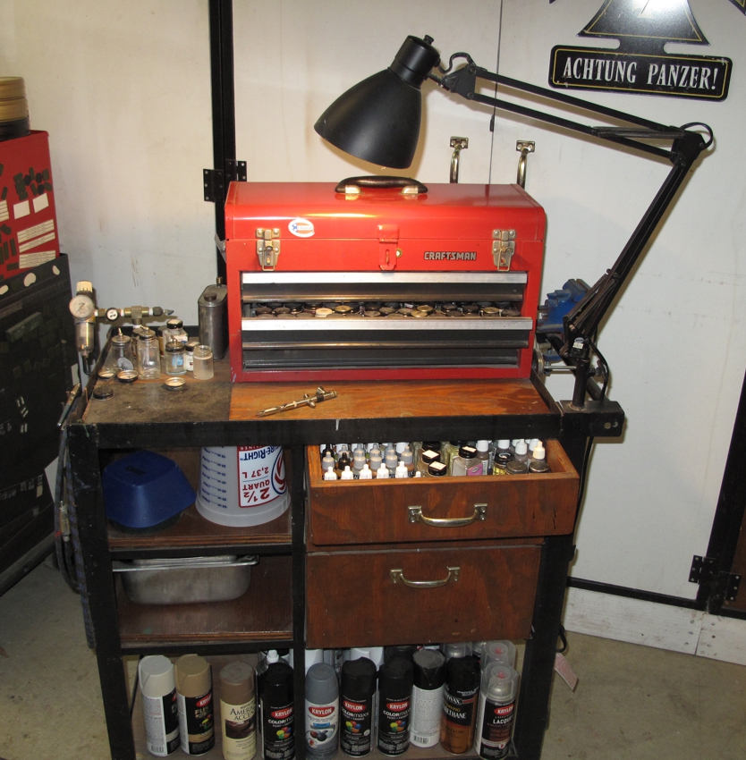
I originally made the move to this second lamp as the old desk lamp was failing and rather than spending $45 replacing it I upgraded. I was about to toss the old lamp out when I got a twinge of recycle-ability and thought I take a stab at repair first. Well I now have a new (old lamp) lamp on my “spray station” cart!

Roll around airbrush / spray can station I built years ago. Hose at rear plugs into shop compressor.

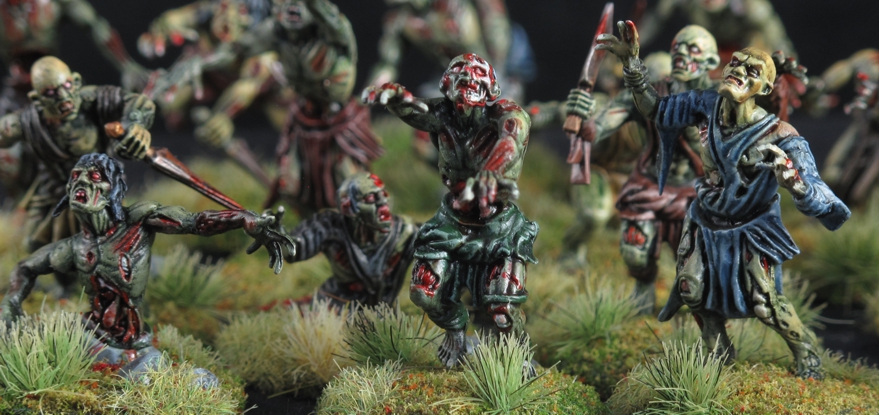
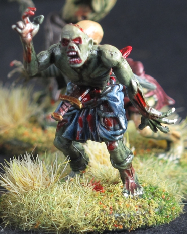
Undead SAGA Warband episode #5 “Mindless”

Well just like the Star Wars franchise, the story of my undead or as it started the “secret” warband doesn’t appear in the exact order it was made in, or posted in. The reasons for this are many, my mood, time to write verse time to paint, time to take pictures, and other things all factor in to when I do a post.

DOUBLE CLICK pictures for a bigger picture!

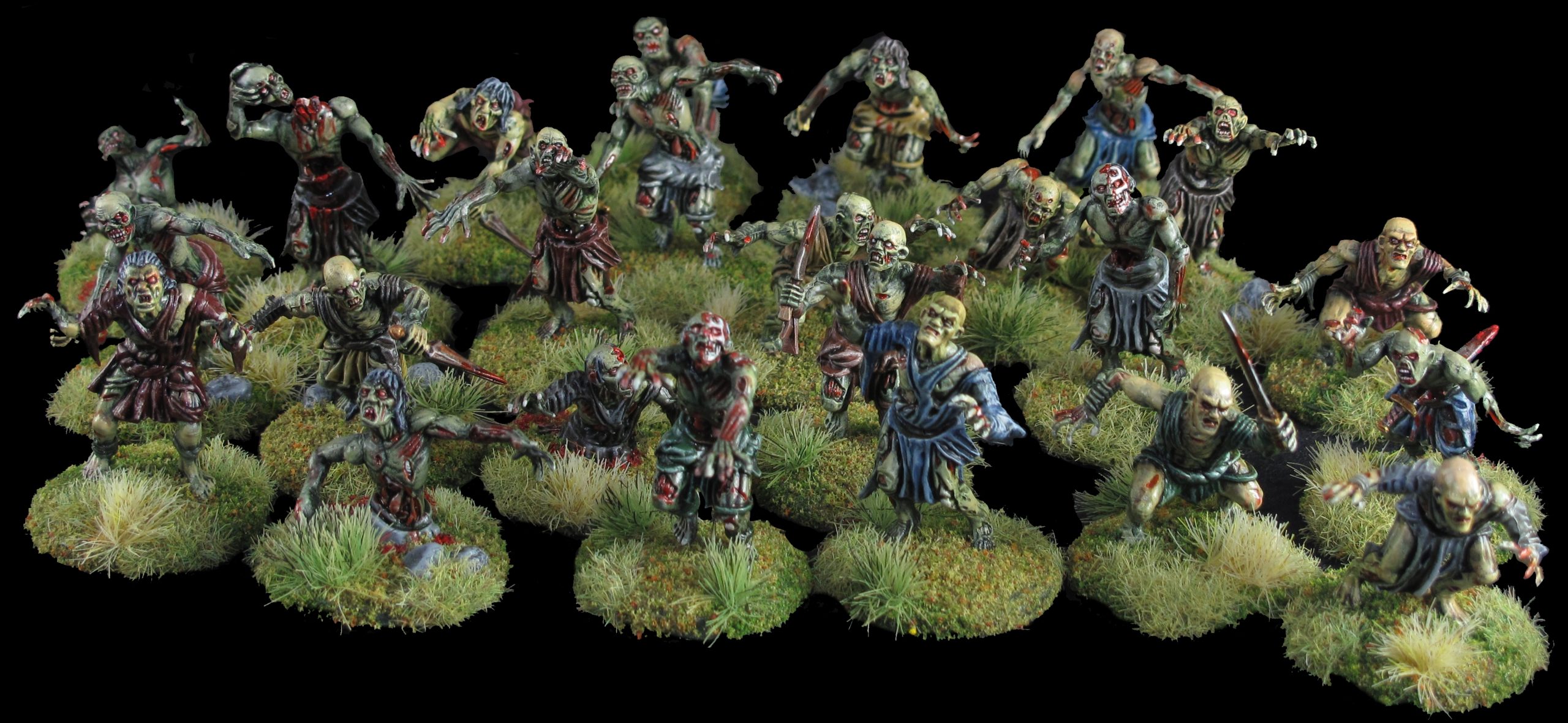
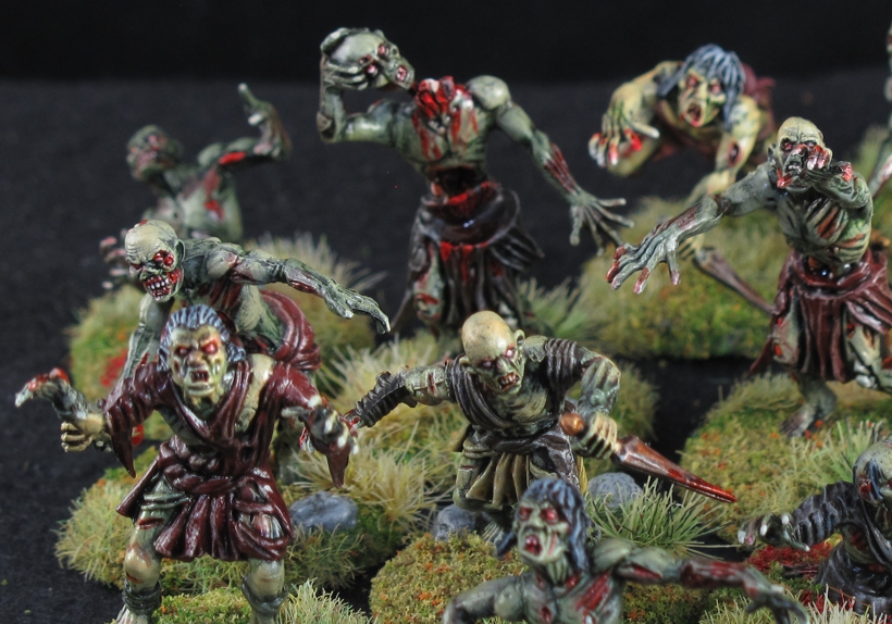
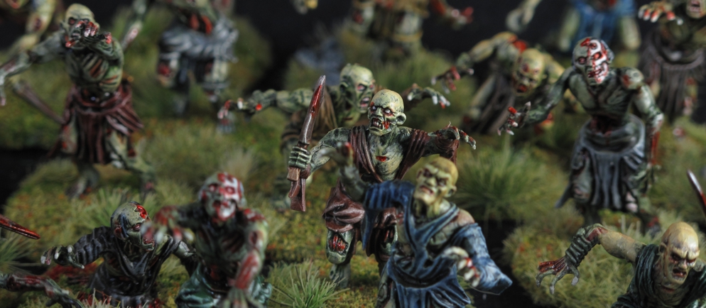
I did these fast and used all the tricks I know to cut corners while still having them look good and match the rest of the Warband. Painted all at once I think they came out pretty well for a “mass o figures”

This episode #5 “the Mindless” has figures that are painted sort of far into the project and figures I was frankly not that interested in painting as I thought they would be simple and uninteresting. Heck how interesting is the paint job on a mass of putrid, rotting, flesh going to be? I thought they certainly wouldn’t stand out on the battlefield like the Skeletal Giant” or a group of charging mounted Un-Dead Knights, and I was right they don’t. I approached this build and paint with an attitude of “let’s get this over with”

Mantic has both Ghouls and Zombie sets and I figured this would allow quite a bit of body part/head swapping to create even more variations. Also being plastic a good deal of figure modification was possible (sharpen up the xacto knife!)

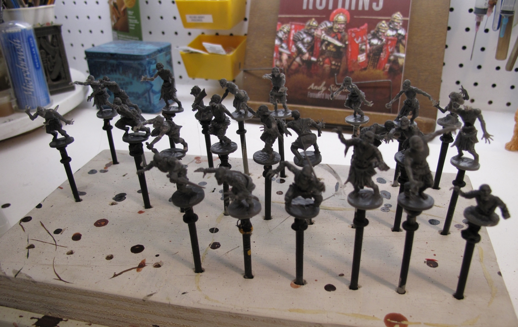
I had chosen to use the Mantic Games “Zombie and Ghoul” figures that appear in the SAGA age of Magic book as part of the “Undead Warband”. I looked at lots of other manufactures, many with great looking figures but soon realized that most manufactures had a very limited range of poses when it came to the look/style required to fit into my warband. I kept coming back to the Mantic line since I liked the very dynamic style and look. Their range while still a bit limited but by being plastic “parts” offered more possible variations than the others. As I have said in the past “Plastic figures have grown on me”, yep from hating them to almost loving them sometimes! Mantic Games offered a combo deal on these figures at the time so with a few extra sprues from ebay I was set to create my 24 Mindless!

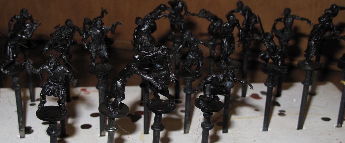
Primed and ready for paint. I usually use a black primer Krylon spray can primer for metals but for plastics my new “goto” is Alclad black primer with micro filler. It works very well but must be applied with an airbrush.

With all of my paint jobs I spend some time thinking about the look I want as well as WHY that look, and why that look works. Last, I decide how to paint them, style, fast, slow, detailed, blending, washes, etc.… although often all this will change as the build/ paint progresses.

A lot of Ghoul and Zombie figures have clothing or weapons that “date” them or tie them to a theme, the MANTIC figures a generic enough to allow them to serve almost anywhere.

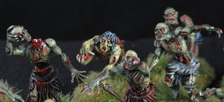
Their flesh is is always in a constant state of deterioration or restoration so my color palette reflected this. I went from near living flesh down to a grey/green rotting look. I loved the exposed bone on many figures and the anguished looks!

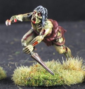
The advantage of plastics is invaluable when doing conversions! This pose would be impossible in metal. The figure was originally a squat pose but by cutting, bending, and use of certain arm combination, creates this dynamic leaping figure.

The first thing I noticed when I began to cut the pieces off the sprues and assemble them was that the majority of the figures are bent over in squat, crouching positions, to much so for me, but the trusty Xacto knife, some glue, and a bit of putty soon had them looking a bit more threatening! About this time I realized I was actually enjoying this build and growing to like the figures more and more. The plastic is high quality and easy to work with, flash was very minimal, although mold lines were pretty bad. I figured that the look and the way I was going to paint these guys would hide a lot of them. Building them was fun and I think I got some great poses often swapping pieces from both figure types.

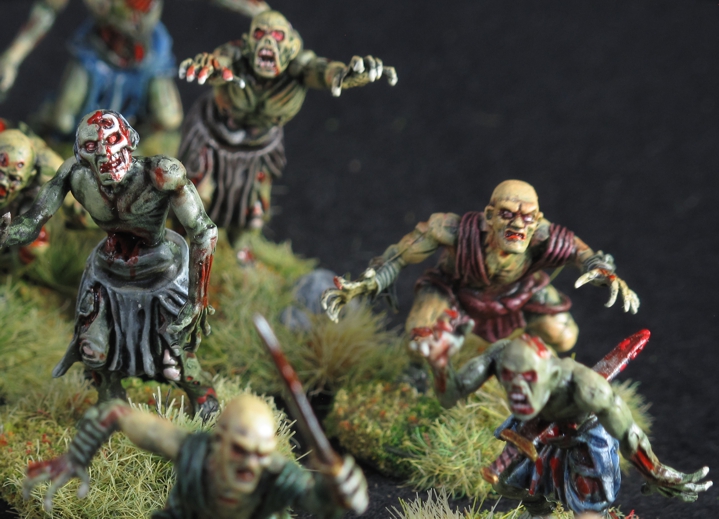
Mold lines like you see on the flesh colored figure at center right were common. I removed some but left many as you don’t really notice them in a group. The sword through the belly was created by me with help from the “bit’s box”

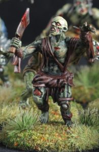
Another favorite pose with a meat cleaver, the camp cook! Clothes were intentionally left drab and nondescript to avoid drawing your eye from the rest of the figure.

Now on to painting. This is where that “why that look” comes into the process in figuring out what “that look” will be. In my mind (a very dusty, cramped, and often dangerous place to roam) Zombies and Ghouls are powered by a dark evil force back into the world of the living, but that initial force can only restore and sustain them for so long. The creatures need to consume the living to continue on and grow stronger, just like a vampire needs fresh blood from the living, Zombies and Ghouls need flesh and brains. So, this governed my thinking when painting them. Individual figures would be built and painted to reflect their current state of re-animation so to speak, some would be just re-animated, in bad shape and wildly looking for more flesh while some of them would be “better” looking more fleshed out and human looking, better fed! Some would be deteriorating, grey-green, falling apart, from lack of food!

Funny how a building and painting session I was not looking forward to ended up to be so enjoyable (really most do!) and I think the final result came out better than I expected! Enjoy and if you do please leave a comment!


“Scabbard? my sword don’t need no stinken scabbard!”

24 figures and every one different! By keeping a consistent palette it allowed me to keep the group look and build/paint quickly as a group even though they are all different.

Several other units are already done and Episode #6 will soon be here!

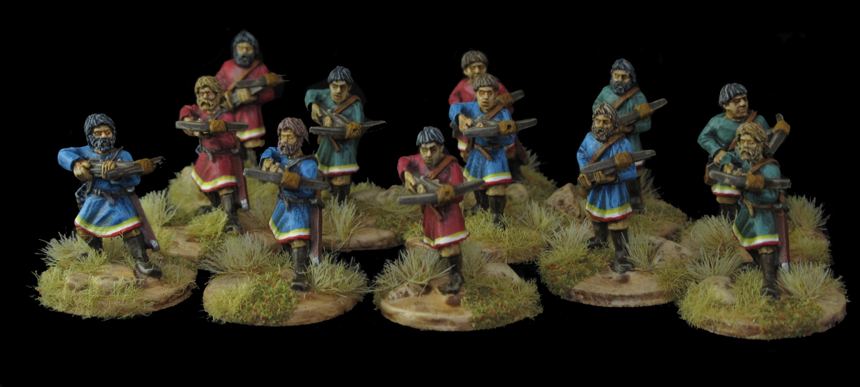
Byzantine Crossbowmen ready for SAGA action!

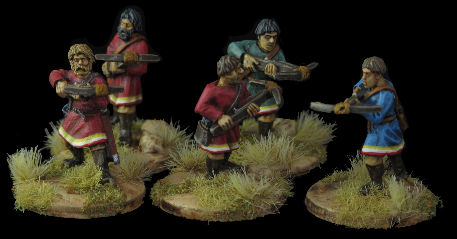
Just short little post here but wow two in about 24 hours! A record for me! These are some Gripping Beast Crossbowmen painted for Chris A’ Byzantine SAGA warband. Yep Chris wants all the possible options and since I had already done some work on this war-band he commissioned me for these. These are the last of 4-5 extra units I did for expanding the original War-band he bought from Stevie G. It must be up to 12 plus points or more!

I think they painted rather well and hope Chris likes them, but I sure wish he’d let me upgrade them with bow strings and bolts! They would really be an eye catcher on the table!

The figures actually paint up nice and were not to bad flash wise. I didn’t like that there were 12 figures in the unit and only 4 variations to the figure. I worked hard to make them look individual as possible but still have a unified appearance, does that even make sense, you get it, right?

I love the “bowl” haircuts on some of them and I gave a few the “5 o’clock” shadow.

I liked the heads on these guys, some having a distinctly roman look while others more barbarian looking, right for this period at what might be said was the close of the Roman Empire. With my working on the house and finishing up projects preparatory to moving out of state, I have been trying to clear my shelf of partially completed paint projects. Both these last posts were projects off that self, finished yea!

Getting a little Spaced Out!

It’s been far too long since I posted up here but its sort of another Covid-19 related dilemma. When Covid-19 first descended on us I was happy to use my “sheltering at home” time for painting and catching up but as the months went on with no gaming, I found the desire to build and paint was less and less. Gaming drives most of us to build and paint, it’s as simple as that! Putting out that freshly painted unit or piece of terrain is just plain fun and justifies all the time and effort.

There’s also the fact that I have a lot more “irons in the fire” than most folks so getting distracted with other projects is common around here! I have been running a ZOOM session with our group every Saturday night and that kept our interest for a while but face it it’s not the same as really playing, seeing the figures and terrain up close, beating the crap out of your friends, or having them hand you your head!

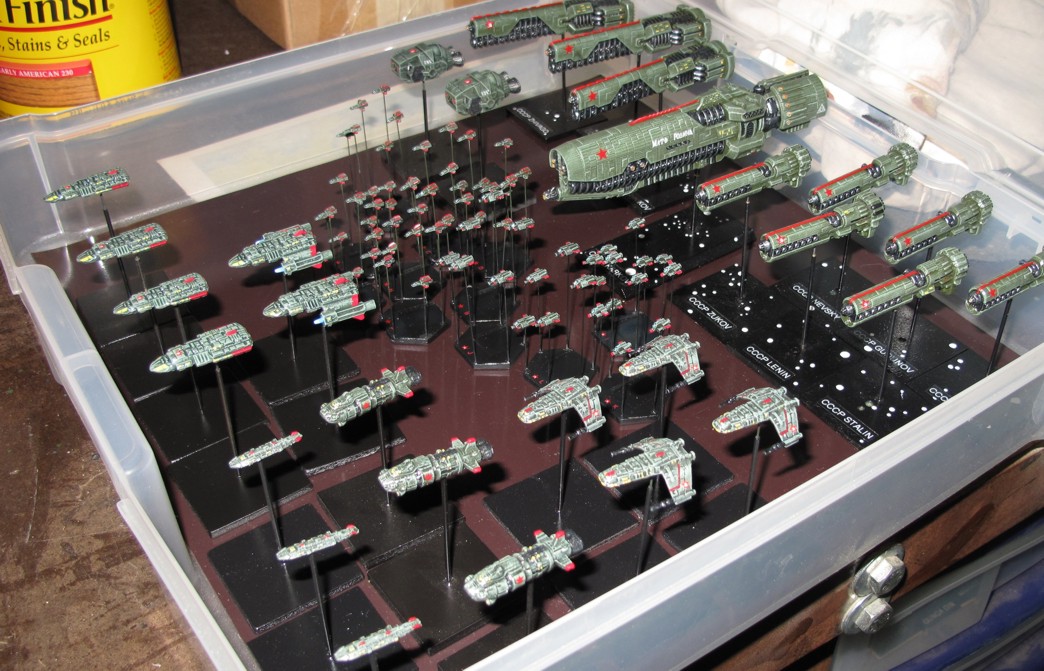
Soviet Union (Commies in Space) part of my way to big collection of miniatures for a game I never thought I’d like or even play years ago! Note; this picture is 8 years ago, the collection is far lager and includes multiple fleets, NSL (Germans), NAC (British/US), Klingons, ESU (Russian/Chinese), Orion Pirates, and a host of civilian ships as well as planets, space stations, asteroids, and more! These ships are a mix of Ground Zero Games, Firestorm Armada, and a few ??? ships!

Well last week we ran a small game for the first time in perhaps 8 months, a game of “Full Thrust” spaceship combat, just three of us but what a hoot! So nice to get together and face off across the table. I umpired the “learning game” for Chris S and Dave D since neither really knew the rules but found I was pretty rusty as well! Thankfully Full Thrust a very easy and polished set of rules nowadays (we played the FT  Project Continuum version) and within 15 minutes or so they were pretty much running the game themselves (I even managed to sneak in an Orion Pirate vessel for myself!)

The game was fun and as I drove home, I found myself feeling a motivation to paint that I hadn’t had for many months, so much so that in the next week I completed two partially done projects of the shelf. Yes of course one was the space ships you see scattered around the post, the other some more un-dead that will be up shortly.

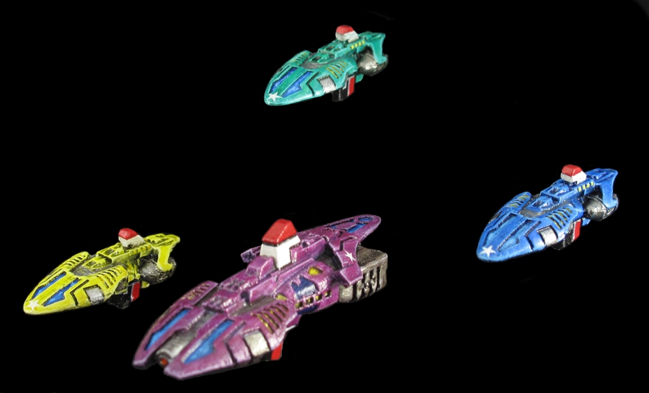
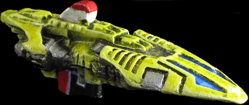
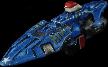
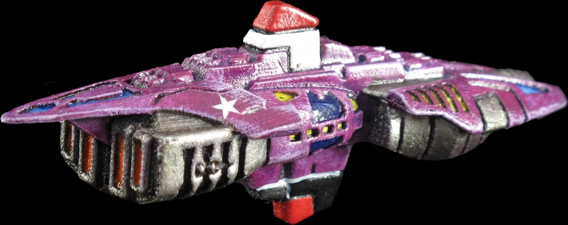
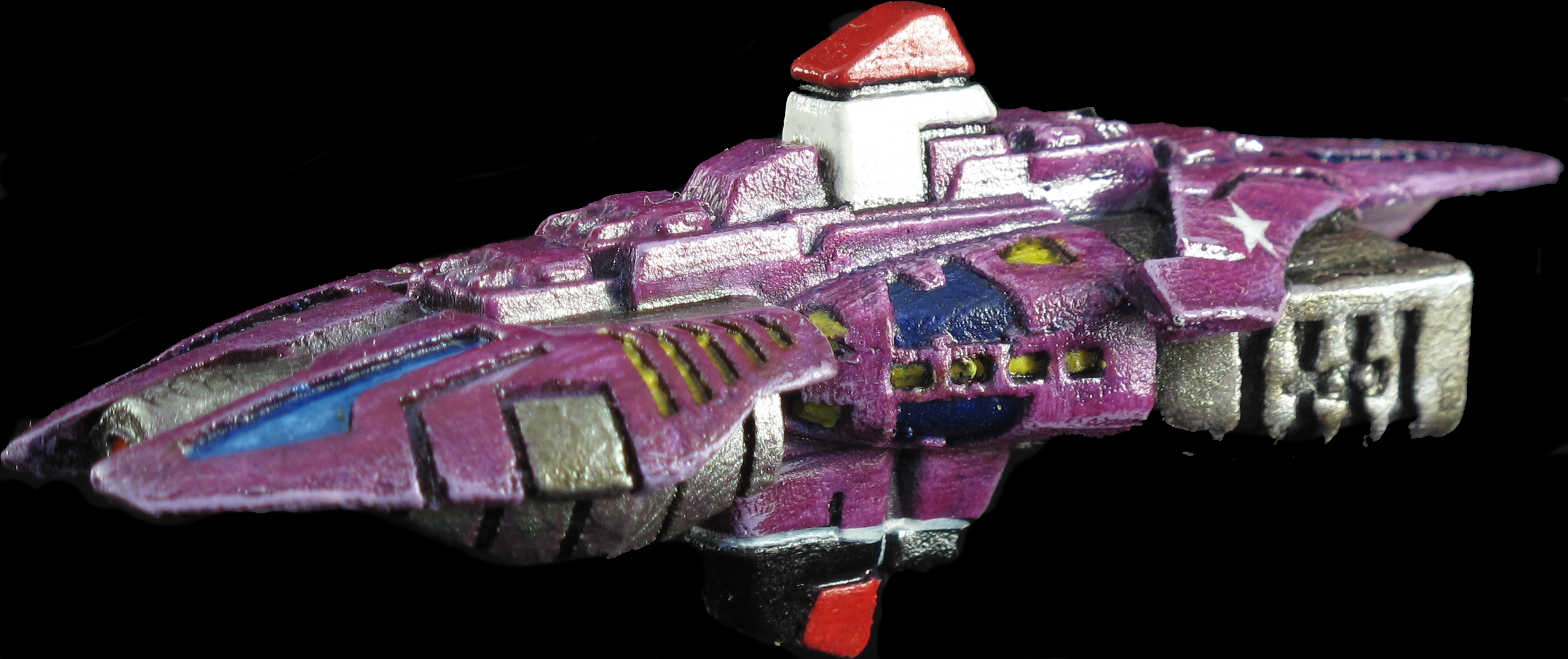
The ships of the Carnival Cruise lines “White Star Line”. Yes on their maiden cruise to the Orion Belt a retired history professor informed the Captain of the history of another long past “White Star Line” While several managers in the corporate promotional department were known to be fired, Carnival Cruises decided since billions had been spent in publicity already it was better to leave the White stars on and bank that few would know or care about the past. Look out for asteroids!

I had received these as part of a large order a few years back to RavenStar Studios miniatures. RavenStar makes some really cool space stuff and as a thank you Chris from RavenStar sent a few ships from his newest line as a thanks for the large order. I got them ready to paint about a year and a half ago but then was struct by “painters block” where the theme for the paint job just eludes you. I had decided to paint them as civilian ships but just couldn’t decide on how to paint them. The simple act of playing cracked the barrier and “Carnival Cruise Lines” moved into space!

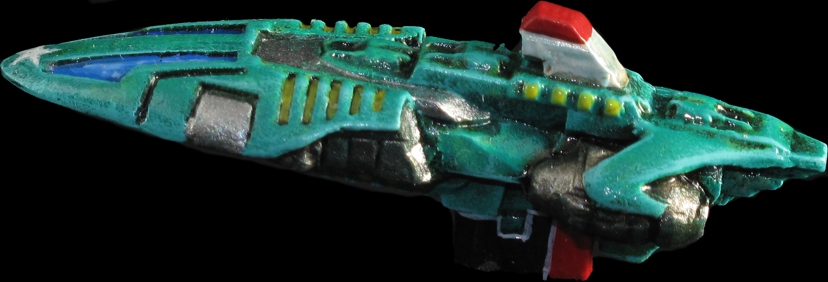
The NEBULA, carries the Second class passengers as well as many of the entertainers who rotate between ships. I love how this color came out, a mix of Vallejo greens. The “Fore-deck” swimming pools can be seen in this shot. Ships were purposely painted with a sort of retro look where the ships conning /operations tower resembles the “smoke stacks” of 20th century liners and the lower section the traditional red and black of the water line and below.

Raven Star Studios carries some very nice miniatures and some very cool things you may not find anywhere else! They have an extensive selection of ship lines with different themes so you can tailor your fleets looks more to the “universe” your playing in, they even have a “retro” set of ships looking like ships from the old 30s to 50s comic book space adventures. Also among their offerings are Space Stations, Repair Docks, accessories for modifying your ships and facilities, as well as tons of other cool items (I’ll be showing some of these in upcoming post).

The Carnival Cruise lines “COMET” carries 3rd class passengers and supplies and additional crew. The ship has facilities like the other two ships Nebula, and Quasar, but is less expensive due to the smaller and less ornate passenger sections onboard. Of course all of the ships allow transporter access between ships although some sections are restricted by class or time. Temporary upgrades for these restricted areas are available to lower class passengers for a fee.

One of the ships main attractions are the “Star Pools” found on the fore-deck of all for ships as well as on the fore and aft-deck of the “Galaxy”. Passengers can enjoy swimming while gazing out at the the universes wonders. The asteroid proof force-field and cosmic ray canceling “glass” protect passengers and ship easily. The balanced gravity adjustment system keeps swimmers and water perfectly balanced no matter the orientation of the ship while filters in the “glass” allow only enough radiation in to give the passengers a nice tan!

The “QUASAR” is the most luxurious of the three standard size cruise ships and is decked out for the “first class” passengers where service and pampering goes beyond whats offered on the other two standard ships, Star and Nebula. The ships also always travel in order of passenger class except for “Reverse Course” day where the return to port or midpoint of the trip is reached and each of the smaller ships spend 4 hours as first in line. On that day there is a “Mardi Gras” atmosphere through out the fleet with guest and crew in costume.

Carnival Cruise lines was not the first into commercial space travel but they were the first to make the “cruise” the main focus of the trip. They worked hard get people comfortable with the idea that just “cruising” through space could be fun in itself (sure some of the cruising happens at warp speed!) and destinations sort of a side show. This was all brought about when an order for a small ultra modern military space fleet was cancelled due to unforeseen circumstances (the buyers home planet hit by a very large asteroid) they were able to buy the almost finished fleet very cheaply. Weapons and warfare systems were gutted, sold, and replaced by passenger berthing and entertainment facilities like swimming pools and Holo-decks.

The Flagship of the Carnival Cruise lines fleet, the “GALAXY” has more onboard space for entertainment than the earth city of Las Vegas, as well as ultra-luxurious accommodations for “Star Class” passengers. Lower class passengers also may beam over to enjoy the ships facilities on a slightly restricted basis.

One of their many innovations early in their transition into commercial space travel was to go back to the “class” system for passengers and in fact they created the “Star Class” of passenger, a step above even first class! It was great marketing as where the super rich go, soon everyone wants to follow!  These cruise ships were fitted out with every form of entertainment and luxury imagined! Since they operate outside of the laws and regulations of most planets systems they are only governed by basic “Galactic Convention” regulations, the cruise lines own set of shipboard regulations, and this leaves them very free to indulge their passengers whims.

RavenStars ships are produced in several mediums, resin cast, and 3d printing?  (I think these are 3d printed but not positive, also not sure if they cast in pewter) and all are pretty darn nice, sculpting and design is first rate! These ships have a super nice look to them and would make a great looking “fleet” (they are part of the Cold Navy, Terran Republic line). I chose to do them as civilian luxury cruise ships for an upcoming scenario I have planned. The only real criticism I have of these castings? is the “striations” in them that lead me to believe they are 3d printed or maybe the masters are done in cad, 3d printed, then cast. Its not really a big deal or that noticeable but it did make painting a bit more of a challenge since using say a blending style of paint work is near impossible with surface irregularities. I could have spent a bit more time in prep perhaps a slight sanding to help this but then it would still be present on recessed sections. I just adjusted my style a bit and went heavy on primer (Krylon black primer) to help and I think they came out really nice!

Space Out!

Bill Witthans

Un-Dead Warband episode #4 ARKHAN the BLACK

To ENLARGE pictures just click on them and use you browsers back button to return to the article.
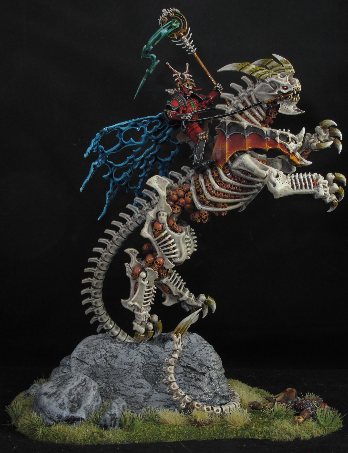
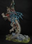
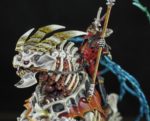
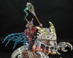
My take on the very popular “Arkhan the Black” figure from Games Workshop.

After I got me feet wet with the “basic” skeletons I was somewhat lost as to what to do next, Warriors, Cavalry, sacred ground? I had all the figures, a huge pile of bags and boxes. I was still unsure of the overall look I wanted for the un-dead army. I new I wanted it to be different and not just copy what was already done by others, I also wanted to use colors and techniques I had not done before, added to this I wanted the whole army to have a cohesive look and theme. I came to realize that instead of tackling another small element of my army that would possibly have only a few of the looks or techniques I wanted, I should go for the Warlord that would have them all. I figured the Warlord would set the tone for the rest of the army, easier to match the rest of the army to something that was already done than to something imagined. Yes it was a gamble as I had chosen for my warlord, Arkhan the Black out of the Games Workshop set for Age of Sigmar, the Skeleton Horde starter set. A beautiful figure in cool full plate armor sitting astride a very large skeletal beast, super impressive! One hell of a big, complicated figure, and one I knew I was going to modify as well!
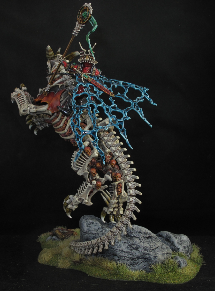
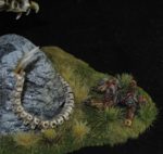
This is a truly large figure as you can see by the “dead” 28mm figure laying on the ground! I’m pretty happy with the project as fantasy is not my usual cup of tea.

Frankly I was daunted at the task as this would be the biggest fantasy figure I had ever done and if I didn’t get it right the rest of the army would be a flop no matter what. There were also things I disliked about the figure.

  1. To many skulls all over the beast, inside and hanging off.
  2. I thought the spectral “Spirits” wrapped around the beast were also distracting from Arkhan.
  3. I didn’t like the look of his head.
  4. The Beast pose was not right to me.

Never the less I started into the figure thinking that like most projects the problems will sort out as you go along and indeed, they did.
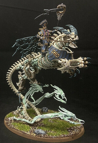
Here is a picture of another painter’s very nice version of the model for comparison. You can see the “Spirits” that I removed, many of the extra dangling skulls that were also removed. This model used the second optional set of armor that is indeed made to fit what I felt was correctly but the second set was designed opposite. This one also has the original “Arkhan” head that I felt reminded me of a baker’s hat or the Pope! Sorry but for me the proportions of that tiny skull in that giant hat were just off.

The first solution I came up with was to tackle the figure in three sections, the Arkhon figure, the Beast, and the Base. This would solve several problems.

  • Priming and painting would be easier as separate pieces. Less troublesome than trying to work with the large assembled figure.
  • I could work with the individual sections to modify the pose, much easier.
  • A complete new base had to be done to better support the modified figure and meet the requirements on base size for SAGA.

Building the figure was relatively easy and went together smoothly with little flash or filling required. I built Arkhan without his head (I was searching for a replacement head) and also left off his cape. He comes with two cape choices and I was unsure if I was even going to use a cape. Either way attaching the cape now would make painting the figure extremely difficult. (I ended up painting the cape as a fourth piece and attaching last)
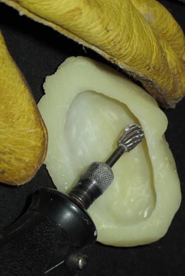
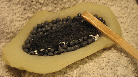
I dremeled out the underneath of the resin rock and filled it with lead shot for weight. Wear a mask!

I thought I had taken more pictures while assembling and painting Arkhan but it seems like always I get caught up in the build and forget!

During the build I removed the supporting “spirit” figures and put them away for later use. I also began to clip off or amputate as many of the dangling sculls as I could off the beast figure. Truthfully, I thought about trying to Dremel out or putty over them as I thought they were a bit over the top for me but to much work! I would much rather have had some rotting muscles or sinew in between the bones. My solution was to under paint them in a way that from a distance it looks like muscle/sinew and as you look closer you see their skulls, works for me!

Before painting I worked out the basing situation by using a left-over resin rock I cast off a stone in the yard for a terrain project. Being sort of small and resin I knew it would be prone to tipping over with the large 7 ½ inch Arkhan figure on it so I Dremeled out the bottom and filled it with lead shot and resin bringing the weight up from 1oz to near 5oz and added a wider base-plate later on for even more stability.
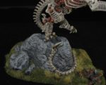
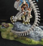
It was time now to fit the “beast” to the rock. I wanted the “beast” to look as if he was leaping off the rock after perching there, more like a leopard than a horse. I used his tail and one foot barely attached to the rock base giving the figure a nice sense of force and movement. This required some strong pinning with hidden brass rods to make it strong enough. The tail also required bending by heating with a hair dryer as well as a few cuts and repositioning so the tail curled perfectly around the rock and minimal contact with one foots claw.
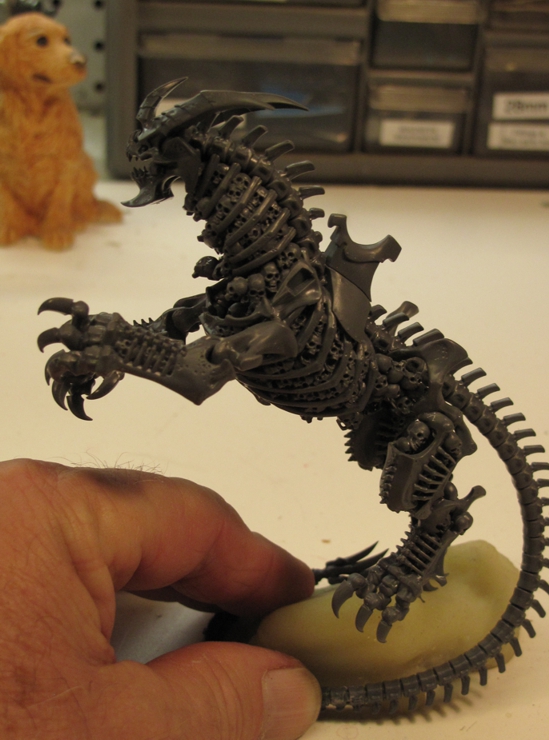
I’m always amazed on how items that kick around in the “bits” box that you think you’ll never use suddenly “are just the thing I need” like this resin rock!
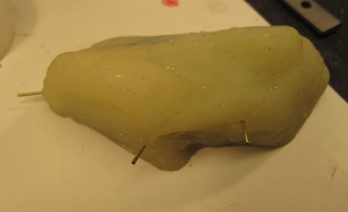
The three pins and the final pin in through the beast claw create a very strong “triangle” structure and really give stability to the model while still giving the impression of not really being connected. I was also very happy with the decision to remove the spirits as I felt they distracted from the main focus “Arkhan” on the “Beast”
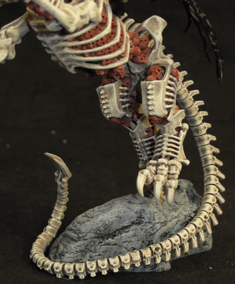
You can see the ends of the brass pins that will be trimmed and glued becoming invisible with a bit of paint.
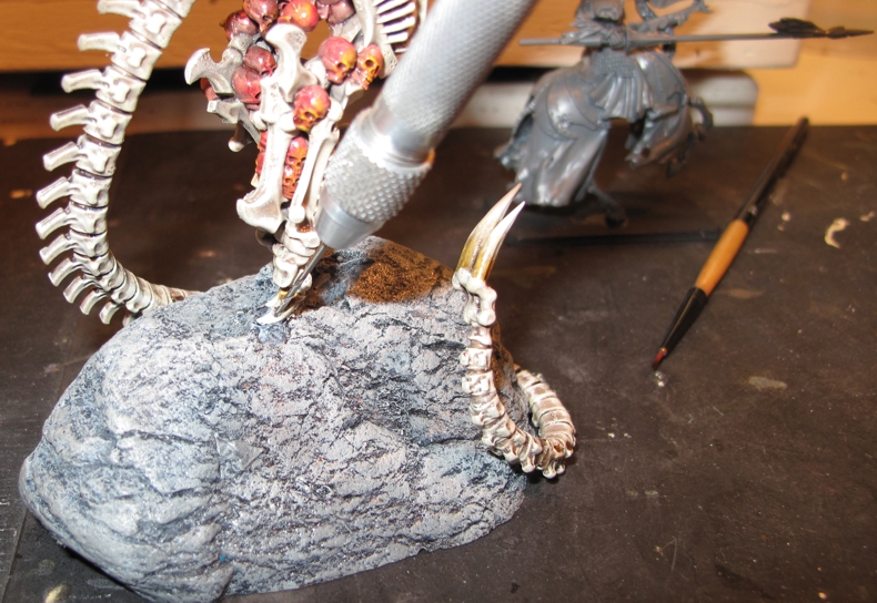
I used a small pin drill to pin the claw to the rock.

The beast was finished first to make painting easier and mounted so that positioning of Arkhan could happen. The position of the rider had to be modified since now the beast was up in a more rearing / jumping upright position and mounting as originally posed would have made Arkhan appear too laid back in the saddle! A bit of cutting, grinding, and filing to both figures soon had him looking good! I also positioned the cape and found a new head more to my liking. The new head was actually just one of the unused optional heads that comes in the same set for the horse mounted skeletal knights, worked out well!
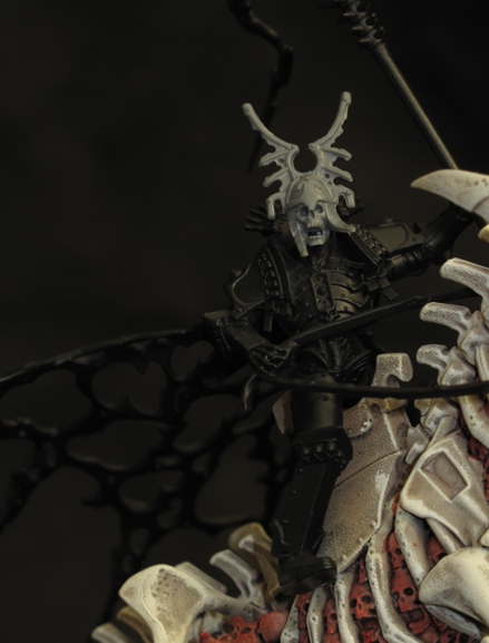
The “new” face of Arkhan the Black, well I guess soon to be “the Red”. At this stage I was working on refitting him to the saddle based on the beasts new pose.

I love the plate armor on Arkhan and while black/metal may have looked good I was using bits of red through out the units to tie them together and I thought “hey Red armor” yep full red armor, the only one, signifying his importance in the warband. I did use black armor trim and for his armored boots to give some contrast.
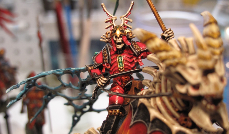
Arkhan the Black all painted up and now Arkhan the Red!

At this point things were going well and I felt good about the build and pushing the envelope a bit with my painting skills when I hit a snag. I had picked out some armor the kit gives you for the beast and choose some the matched Arkhans style. Without pre-fitting (mistake!) I primed and painted it. On trying to fit it on I found that it was designed to go on exactly opposite of what I thought and wanted it to be.
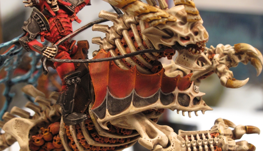
This is how it was designed to fit, looks terrible! Probably why on 99% of the pictures of finished models on the internet use the other armor option!

I thought that this looked well frankly, stupid and silly, the plates going up like that but oh well, I guess someone liked it . I used a bit of picture tack to reposition the armor as I wanted it (upside down) and to my relief found it would fit (with a bit of cutting).
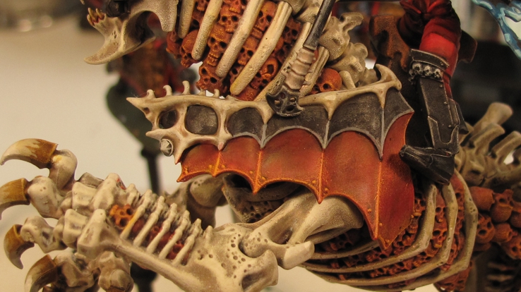
Checking position I found the front bone had to be trimmed to make it fit. I should have pre-fitted this before painting! I know better!

However, there was now a large gap in the front because of the mismatch caused by reversing the pieces. This was one of those times when a modeler needs to set the project down for a day or two and think it out. I was too mad at myself and the piece to do good work. After calming down for a day and thinking it out I came to the conclusion, I hated the armor installed as designed but hated the gap caused by installing upside down. Ok, out comes the plastic sheet, epoxy, and some greenstuff (kneadite). The extra few hours work get filed under “lesson learned, again!”
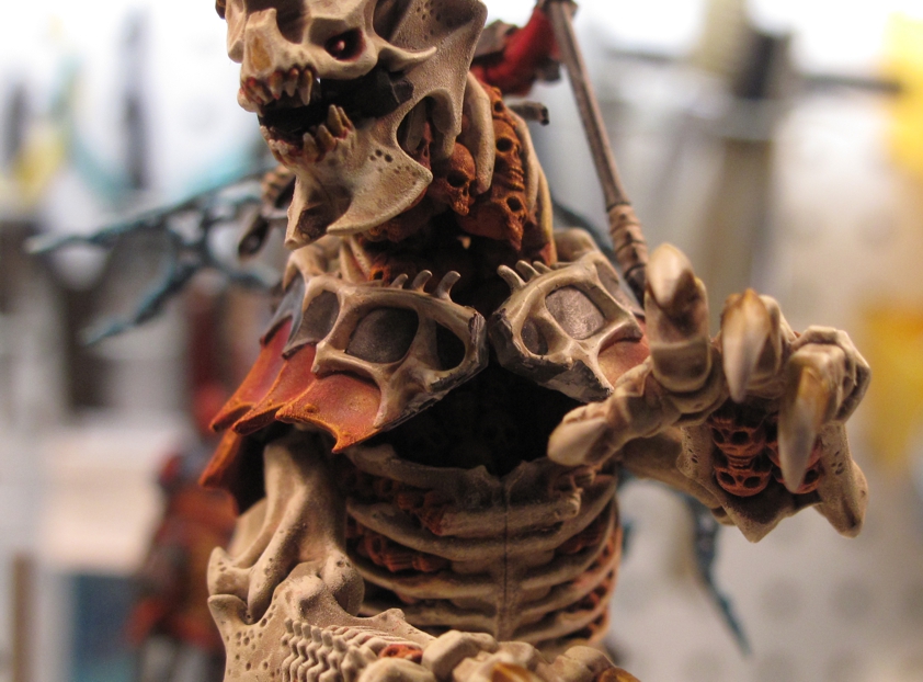
The gap was bloody awful! I thought about taking the cowards way out and just touch up the paint, most would never notice, but I would, forever!

I put the armor on using “picture tack” to temporally hold it in place and then a bit of glue up front to bond the two halves. I took a few pictures and a few measurements to insure it went back exactly where I wanted it. The measurements were also used to make sure that I had it right for the next step. I carefully removed the armor. The solution was to create a small triangle backup piece to fill the gap, bond the pieces together, and serve as a backing plate for the additional greenstuff bone horns and armor.
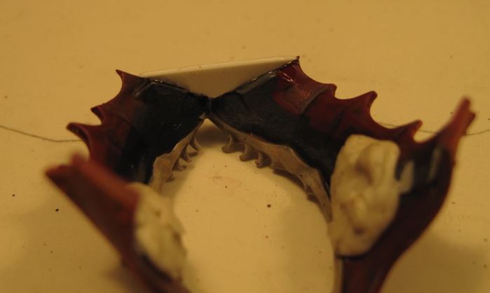
Polystyrene plate cut to form base and bridge gap.
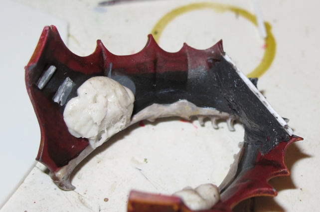
Reinforcing 2 part epoxy added (the grey stuff on the right)

This plastic “plate” was super glued in and given a thick backing of strong two part epoxy (JB-Kwick Weld) for added strength. A bit of work with the greenstuff and my modeling tools and I had a very acceptable fix!
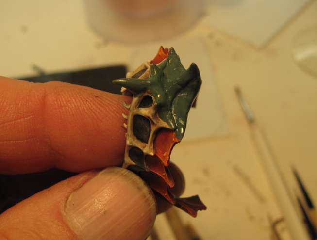
Bone and armor plate sculpted to taste!

A bit of paint and I can just hear people saying “wait my kit didn’t come with that option?” Putting it back on the model was a bit tough as it had to be stretched to near breaking. That’s why I used the two-part epoxy as superglue is brittle and would have given way.
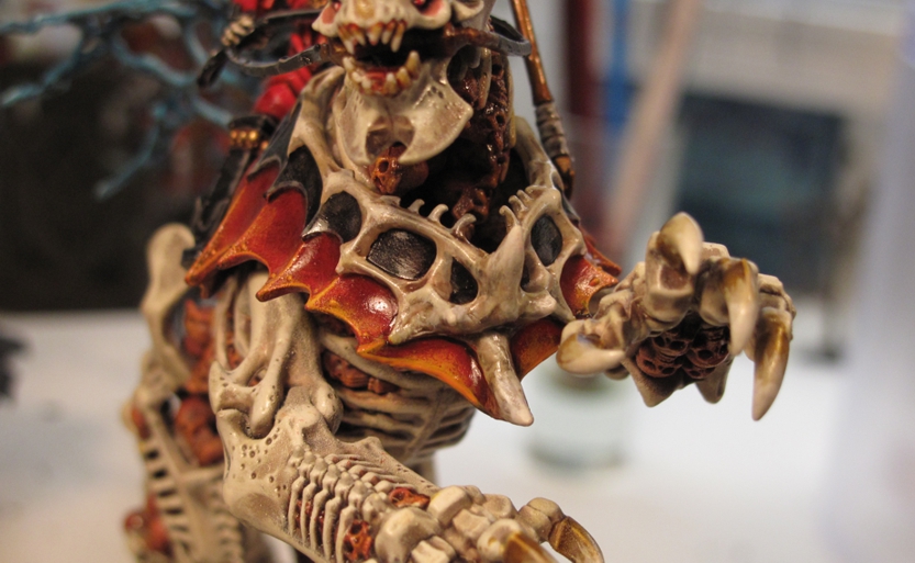
In place and looking much better. I really love it now as it looks very form fitted and flows down the beast sides
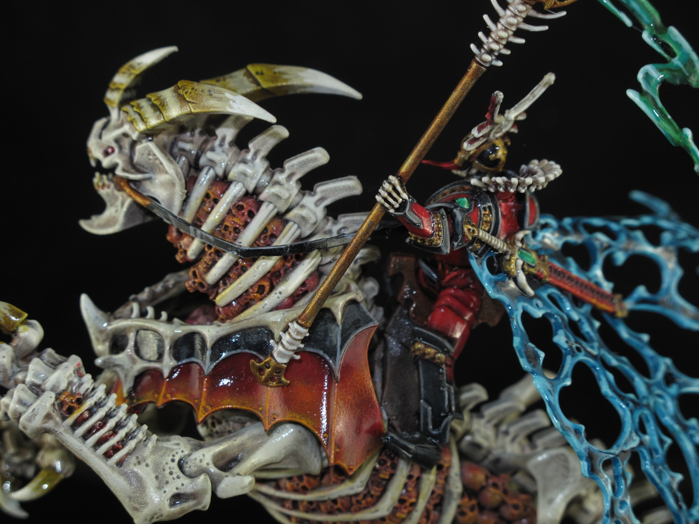
I love how the armor seems to be custom fitted over the beast shoulders.

I was unsure of what I wanted the armor to look like paint wise and almost went with the same blood red color as on Arkhan. Once again not wanting to draw attention away from Arkhan I went with a different look but still in keeping with the style. I really like how it came out but don’t ask me how I did it…. The model is coated with a combination of Testor’s clear lacquer coatings ranging from semi-dull to near gloss, applied with and airbrush at around 15-20 PSI. Over the years I have started using different blends of clear coats to enhance the look of figures and I think it works well here to deepen the colors.
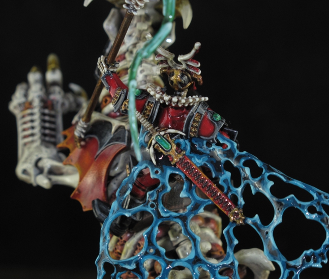
Gems in the sword and on his armor were done as Jade and emeralds.

I have never been good at doing precious stones or gems, mostly because there are few opportunities when painting 1812 French or WWII Panzer Grenadiers but I tried to improve my game while doing the un-dead as several figures have them. There are other effects on the figure that challenged me with new looks like the ghostly spectral force cape and the flowing magical whatever it is off the gem… yep certainly none of that on a Panzer Grenadier! Fun none the less!
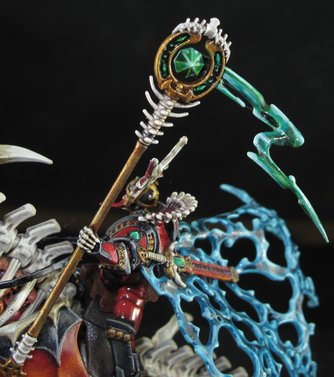
Frankly I almost took the cowards way out and switched out the “magical power staff?” for a sword but I’m glad I did not as it ads height and looks good with the figure. It also helps to create the sense of movement I wanted.

Well If you made it this far thanks for reading it and I hope you enjoyed it I know I enjoyed the project immensely. I will leave you with a few gallery pictures and some comments. There should be some more of the Un-Dead up soon as I have paint most of it already, painting is fun, writing is too, just not as much. This website in the beginning was about reaching to others in the hobby, but over time I have come to realize it is more for me, a  diary of “My Journey in the World of Wargaming”

Rourke’s Drift Project

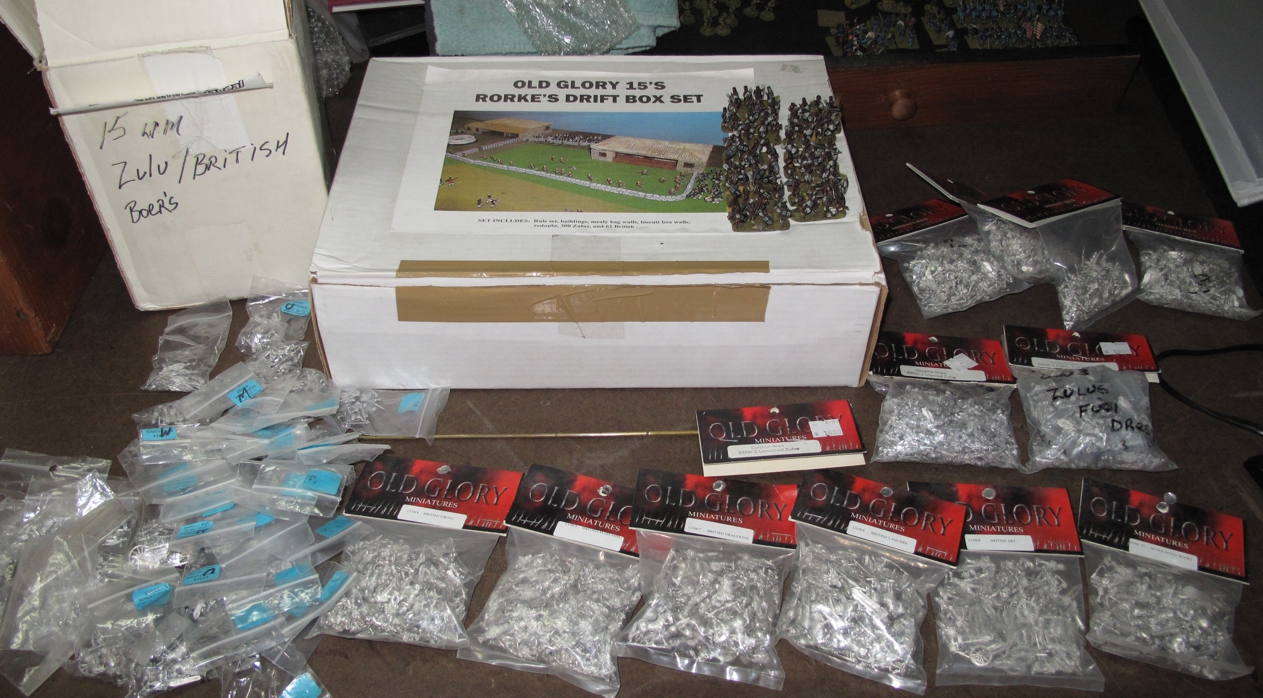
I have over the last few years been trying to put up more pictures of miniatures I’ve painted and projects I’ve done because after all this is “My journey in the World of Wargaming”. So here is a quick post up on some commission work I did some years back for a gamer many of us know and have battled with over the years, John Curran. While digging around my enormous pile of unpainted lead and stalled projects I found my “all the Zulus in the world” Rourke’s Drift project in 15mm sitting in several boxes. Now I love this period, had purchased nearly all the figures,Zulu and British, that old glory 15’s (now 19th Century Miniatures) produced, and also the whole Rourke’s Drift building set from Richard Huston himself at Historicon years ago with great intentions. However, after painting about 400 of them realized that this would be a seldom played game and frankly had drifted into other pursuits miniature wise. So up on the TMP “for sale” page they went only to be purchased by of all people fellow gamer (now living in another state) John Curran!

Yes like many of us I go a bit overboard when buying for a project!

John bought the whole set, figures and buildings, and also wanted me to paint them! Funny, I was trying to reduce the lead pile to create time for painting other items and now I ended up painting them anyway. Well not that strange since there are somethings that I really want to paint or build and this Zulu project was still one of those.

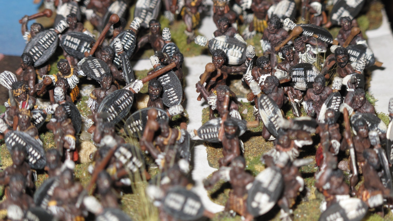
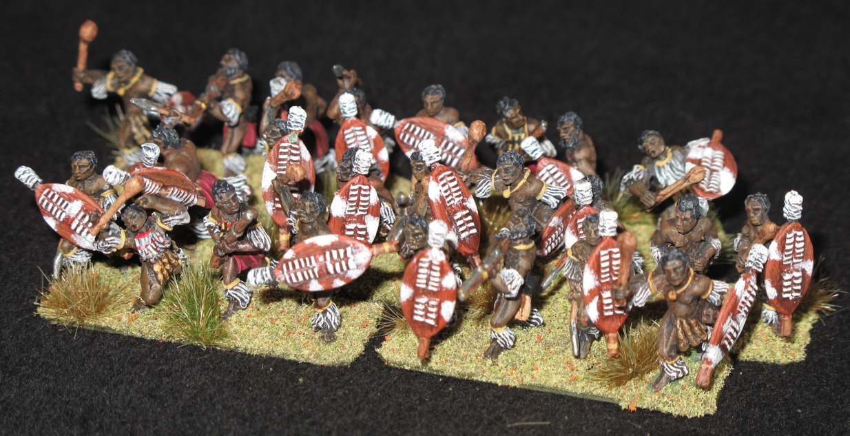
The vision of thousands of charging Zulus must have been terrifying! Back in the day I was still trying to paint eyes on 15mm figures! Silly me, although on these the tiny white in the eyes does help to define the face more.

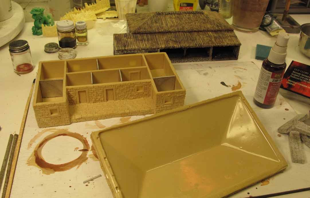
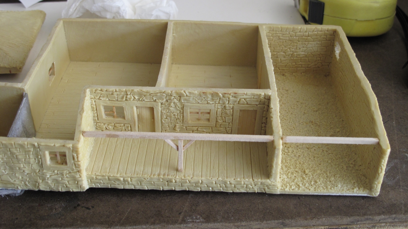
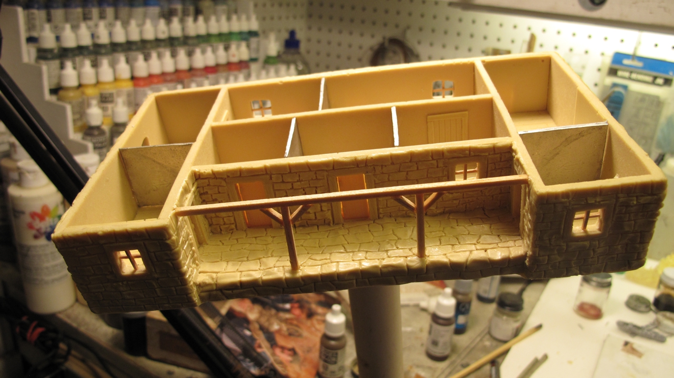
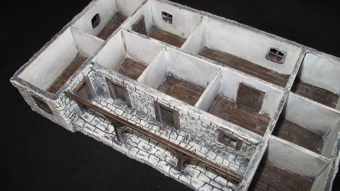
The Old Glory set is rather nice and after a couple of additional details like supporting beams, room partitions and widow frames was ready for paint.

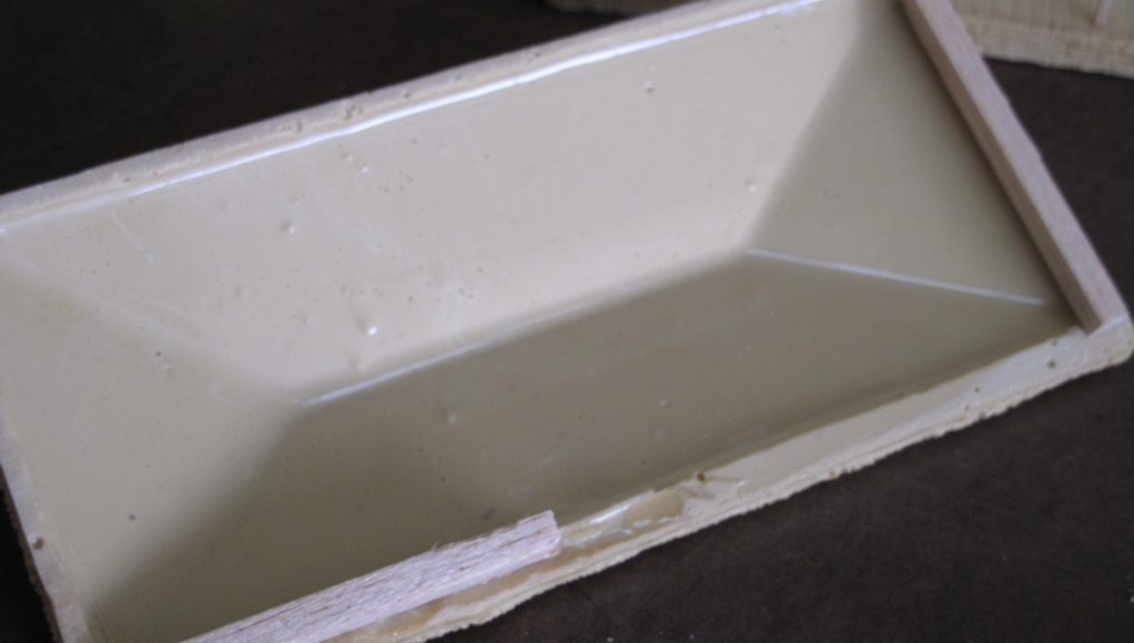
The roofs had nothing molded in to hold them in place.

Wood strips were added to keep the roof in place and not sliding around during the fighting!

Just a few extra details added. Balsa wood support beams and window frames ad a lot to the lifelike look of the building.

Ready for primer! I almost always use Krylon auto Primer. Flat Black!

Doing Zulu shields is like Medieval Heraldry there are certain colors for each “regiment” and I just gave up and painted what I liked withing historical constraints of course!

It was a fun paint and I felt a bit of satisfaction in finishing Rourke’s Drift even though I probably will never see it used. I hope John gets some enjoyment out of it!

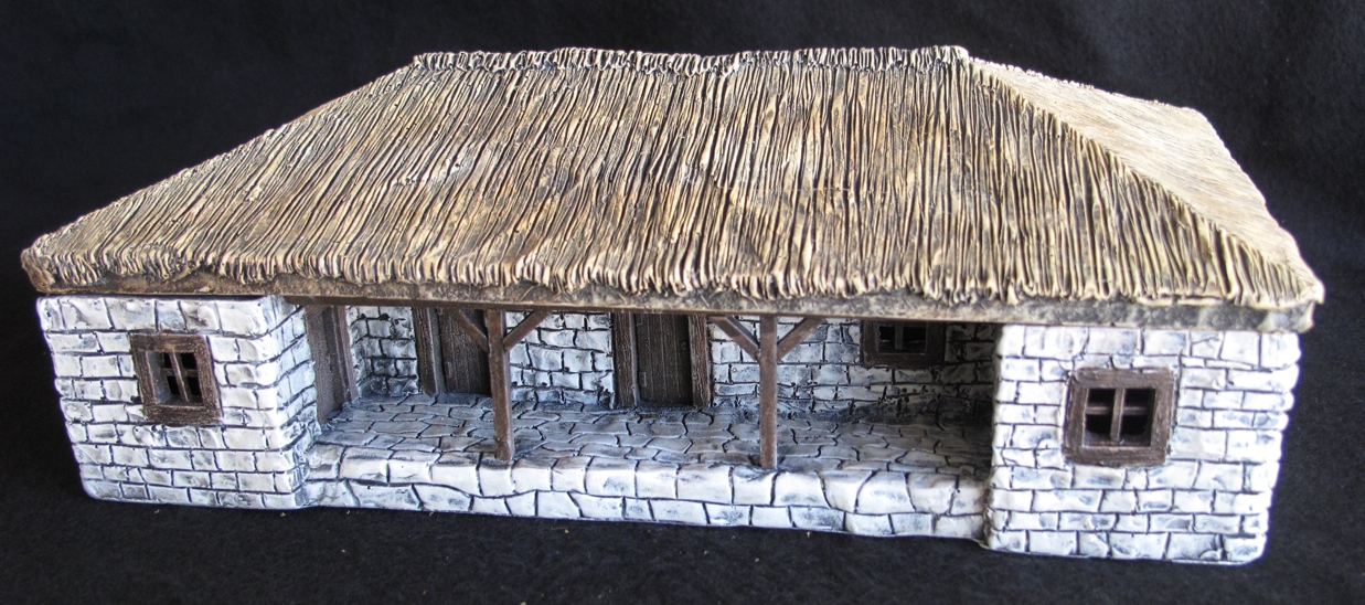
Building #1 done!

I thought about basing the buildings but since I was not going to use them and I was not sure of the table setup/mat John might use I went without. The boxed set (no longer produced?) comes with Two buildings, Mealy bag wall, the Kral, Redoubt, and the ovens.

Nice interior for that desperate room to room fighting!

Looking back at this stuff make me sorta wish I never sold it, but as the French say Sela Vie, whats done is done, or something like that!

The Secret Warband episode #3

As usual my posting of projects and updates has gotten spotty at best as my house remodel, commission “build/paint” projects, and just painting for myself just left little time. When you add Christmas into the mix and a full-time job it’s near impossible but here’s episode #3 of “The Secret War-band”.  I guess that after 2 previous post on them it’s hardly a secret anymore, and in fact there are enough of them finished that we played a 6 point SAGA game with them about a month ago! It was our first “Age of Magic” game and even though they lost  my opponent said they were an intimidating force to look at anyway! (who knows as it was close and we misplayed many things)

I was really happy with the look of these and they gave me a chance to expand my painting skills with colors and techniques not normally used on straight historical s.

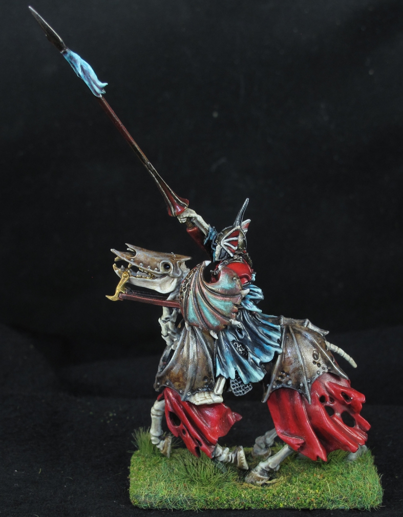
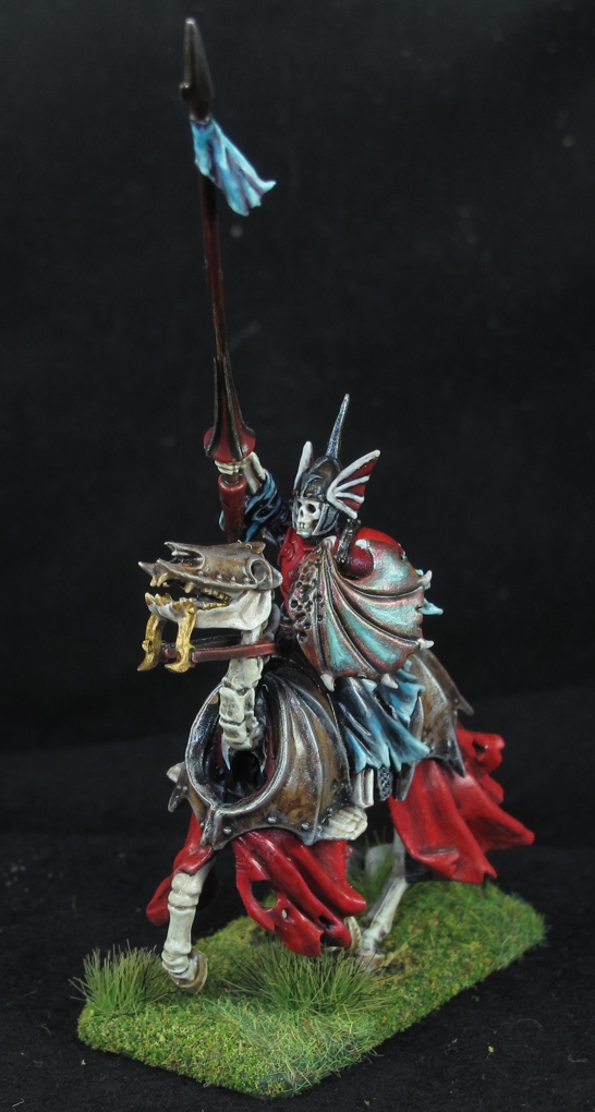
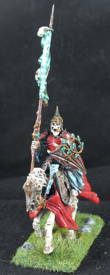
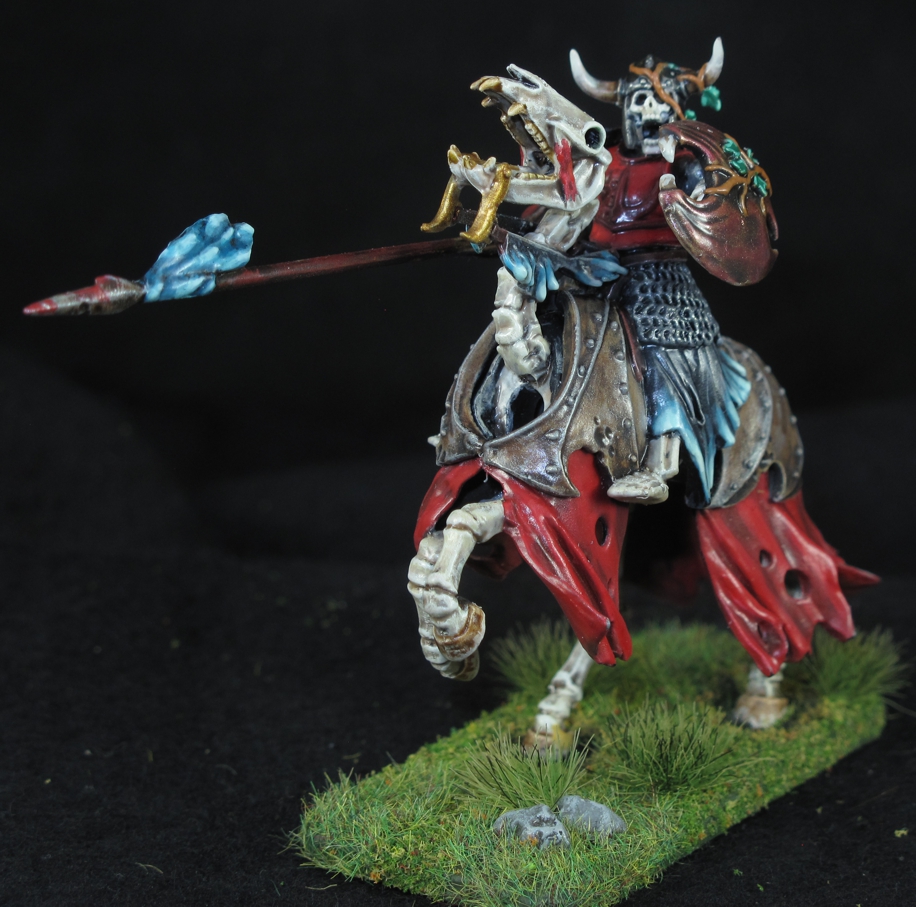
The basic warriors that you saw in the last post were fun and a simple way to start getting colors and a style down. After doing about 30 of them I decided to switch it up and move over to a more complicated Hearth guard unit of mounted un-dead knights. I looked at a lot of different manufacturers but settled on Games Workshop figures from their “Age of Sigmar” collection. Particularly I used the “Black Knights” from the large boxed set “Skeleton Horde” that contains, 10 Warrior infantry, 5 mounted knights, and the warlord “Arkhan the Black”. It’s not a cheap set and I was a bit worried that I would not like them. I was really hunting for a badass Warlord and with some modifications I felt “Arkhan the Black” would be great (more on his build/paint soon). After doing enough research on the internet about the figures and seeing the different builds from other painters I felt they would work and took the plunge.

Where ever you look on these guys there is some cool detail.

Yep, after nearly 40 years I actually broke down and bought some Games Workshop mini’s! Well sure I had bought flee market bits and pieces for conversions before, but never paid full price for figures to be used in an army like that. While I do use some of their miniatures at times I have never been interested in their games or style of play. Truth be told these figures are very nice and not goofy looking or too “over the top” like I feel most GW stuff is (well for my taste). These are plastic but they are well defined, go together nicely, and being plastic are easy to modify should one want to, and I always “want to!” Being a guy who beats up on Games Workshop at times I have to say I really love their “Age of Sigmar” line!

I really like the sculpts on these figures especially the horses. They do give you a bit of  choice for variety when building them and they fit together easily with little flash. I was a bit apprehensive looking at all the detail and every-time I looked at them it seemed I discovered more! I let them sit on the bench for about a week while I thought about and worked out the color/paint scheme. This always helps me to avoid choosing colors/combinations that don’t work, ends up with a better looking miniature, and actually saves time when the painting starts. Even then I was a little apprehensive about painting these guys but once I started and got into it was actually fun .

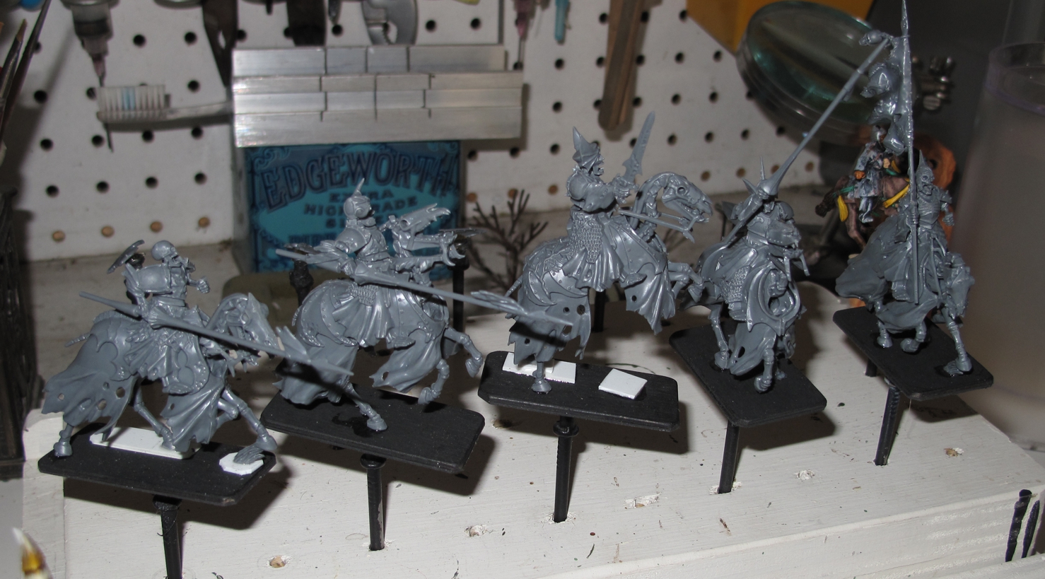
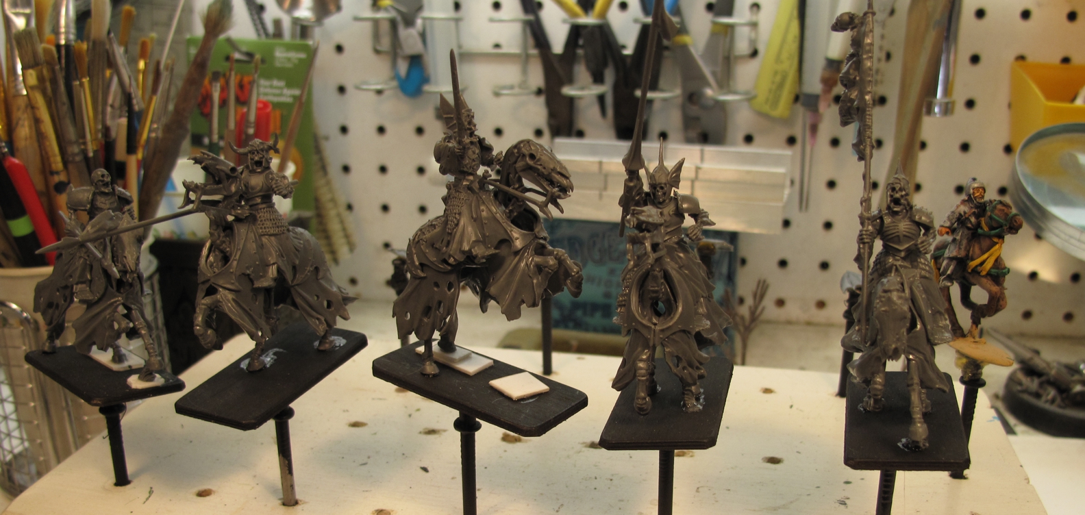
I did some re-posing of the horses to give them a bit more dynamic look to them.

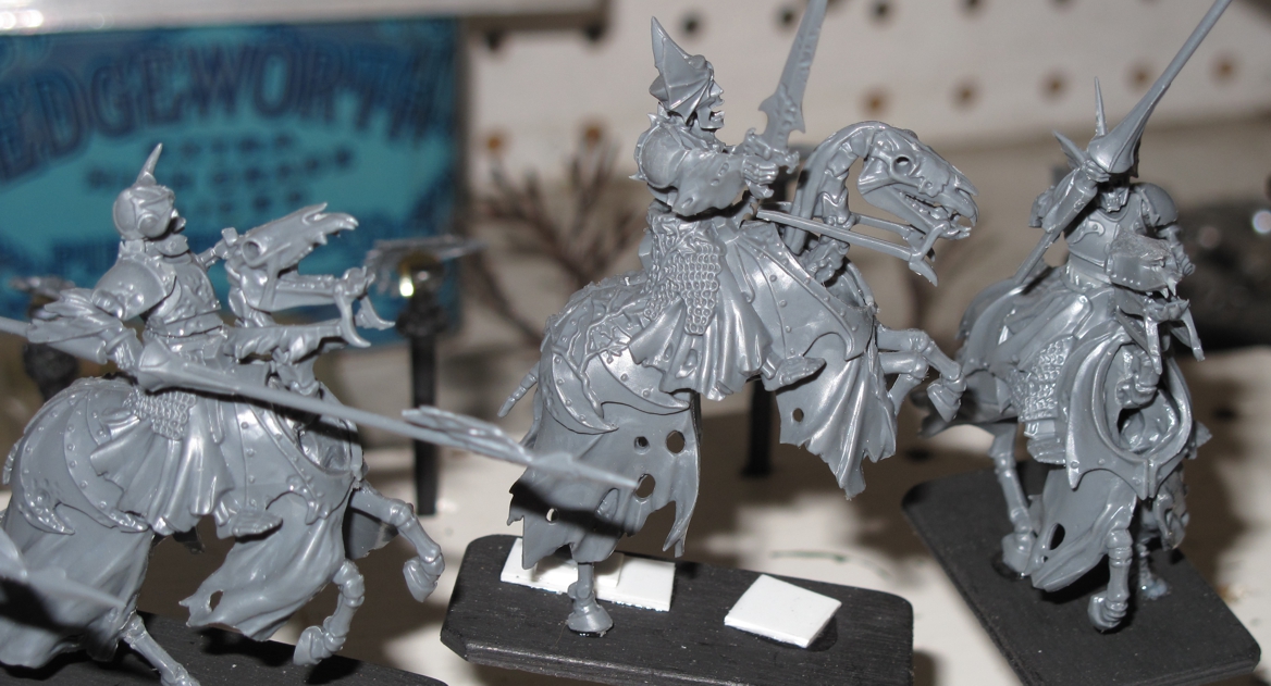
The more I use plastics the more I like them because of the ease of conversion. These looked great out of the box but I still did some things to make them different, like creating a rearing horse pose on the leader horse and a leaping pose on another. I also cut out some of the plastic “grass” support points to make them look less like models. Make sure though when you do this the model still retains its strength overall on the base. This means you may have to ad or strengthen other supports. Being plastic helps as drilling and placing “hidden” brass or steel pins is much easier than in pewter.

Pro Tip: a light coat of QUALITY super glue over a possible weak section creates a hard reinforcing “shell” strengthening the area.

Plastic polystyrene pads are placed to level modified poses or help in creating variations in the basing.

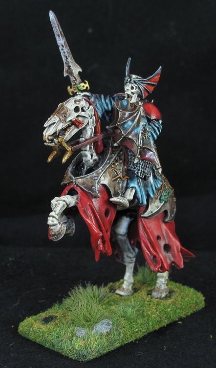
After building them and taking time to work out the color scheme and what part would get what treatment painting began. I had already decided that the over all color scheme of the army would be bone (obvious right) with Black, Rust, and a bit of Bold Red tying it all together. Accents would be Gold/Brass, and a mix of ghostly un-dead green/blue shades mixed in where appropriate. This ghostly color really helps offset the black and red as well as contributing to that feeling of strange magic   This army would be sort of “clean” compared to some other un-dead army’s I’ve seen.  I wanted the details to show and the army to “pop” and not just blend into a indistinguishable mass of rotting figures that I’ve seen in other army’s. I have added some rust, rot, and decay, but I have kept it to a minimum and balance it with the cleaner look of an army that has been magically “restored” well at least partially!

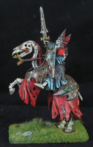
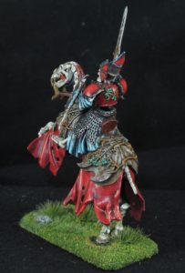
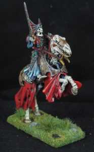
This horse was selected to convert from a normal galloping horse to a rearing horse like in the movies where the hero rears up his mount and brandishes his sword just before he charges. The figure also requires a bit of work to now sit properly on the mount.

These were fun to paint, although the detailing is more time consuming the way I picked it all out. Options for different styles and having them paint up much faster is easily found searching the internet. I have seen entire armies painted in a “ghost style” with a few colors, washes, and highlights painted in less than a week! They looked good as well but not my “cup of tea”. I was not concerned with time and really wanted to push my level of painting up and into new territory, I went slow and had fun with it.

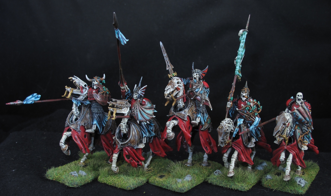
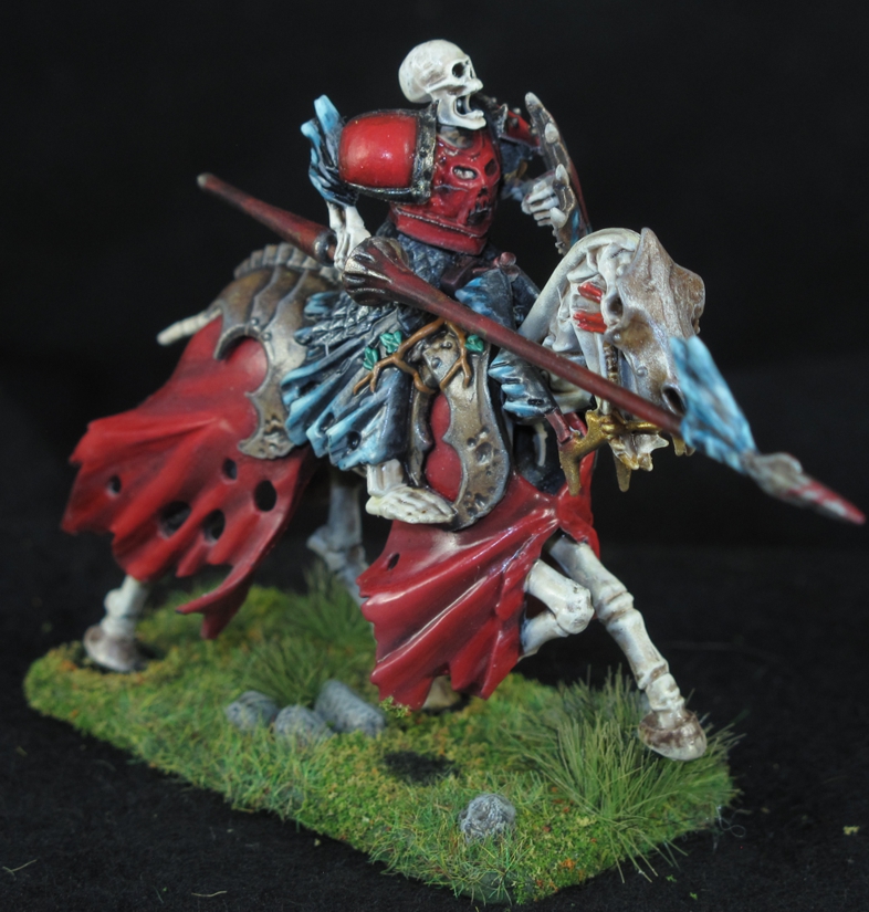
I really like the dynamic pose’s on these figures and the sculptor really did a great job on conveying a sense of movement to them. I also love that if look you will see that each figure while having a similar “horse armor” on, each has it’s own pattern and that is carried over loosely to the shields the figures carry.

I also pushed into new territory with paint and for really the first time started using quite a few of the Games Workshop paints. I had used a few in the past but just special things like washes or blood and everything else would-be Vallejo paints. I have to say that they do make some very cool colors and technical or special purpose paints that work very well but on the other hand their paint is over priced and the paint pots suck (my opinion). Nearly twice the cost of Vallejo for less paint and their paint pots do not seal well. I have taken to transferring the GW paint to “drip tip” bottle such as Vallejo and other companies have gone to, but again this adds to the cost and time factor!

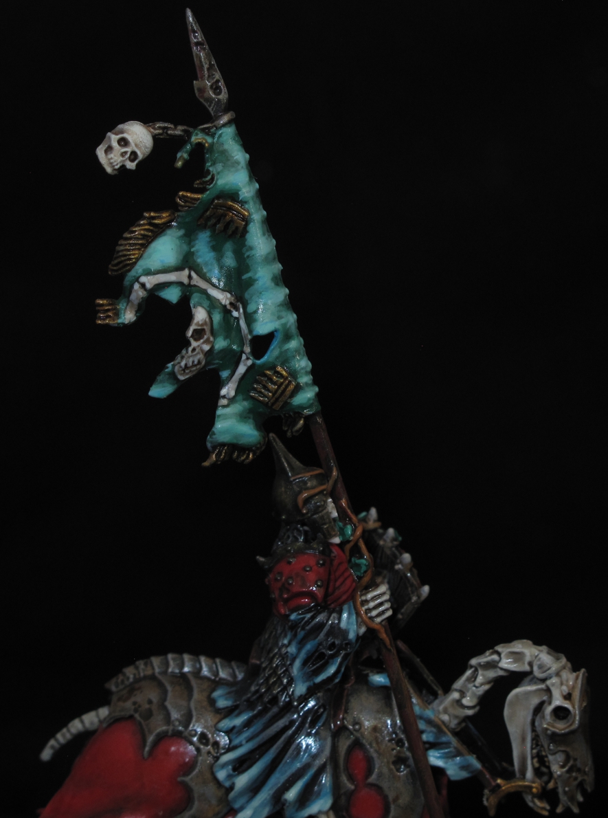
I made some strides in improving my blending technique on these, lots of blending is something that is difficult to justify time wise when painting large numbers of figures as opposed to just 1-2 figures, leaders, or specials. The shields were at first just a plain brown/rust and I didn’t want to ad any designs as I thought the figure was “busy” enough already. After some thought the ethereal glow was added to try and show some “dark magic” was present.

About 6 months ago I started using a different primer for my plastic figures (requires airbrush) called Alclad II Lacquer, it comes in Black or White and has a very fine micro filler in it. It’s used by model plane builders mostly but was recommended to me by one of the guys down at Burbank’s House of Hobbies. I have come to love it! It’s very thin and sticks well to plastic giving a excellent bonding surface for following paint layers. To simplify things and speed the paint process up I used the white version as my primer and also the first coat for the skeletal “bone”. After this a wash of GW  “Agrax Earthshade”, a heavy dry brush of GW “Ushanti Bone”, and finally a light dry brush/spot highlight with Vallejo “off white” make a very convincing old bone look. Yes the GW paint line has goofy names that I cant pronounce or remember but they are invaluable for some effects.

Pro Tip: Burbank’s House of Hobbies is an “old school” type hobby shop run in a very modern way! Very knowledgeable, great service, tons of stuff, great prices, and excellent mail order serving the whole country! The store is always well stocked!

The poses on the figures and the way clothe on both the horse and figure are done really give the impression of movement, something not done as well by some other manufactures. Ive used a “tuft” of grass to cover the support under the front hoof  while the other hoof had it’s support removed, it really gives the impression now that the horse is galloping over it.

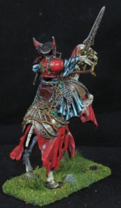
That effect of carefully thinking and planing of colors and layout can be seen here where the two large areas of red are separated by the rusty armor and the black cloth/metal armor on the figure. This allowed me to then paint the top armor red and have it stand out, something that would not have been the case if there was no color separation. One of the plans for this army was to have a bit of “red” on every figure to tie it together but the amount of red on the figure is directly related to the figures importance in the army.

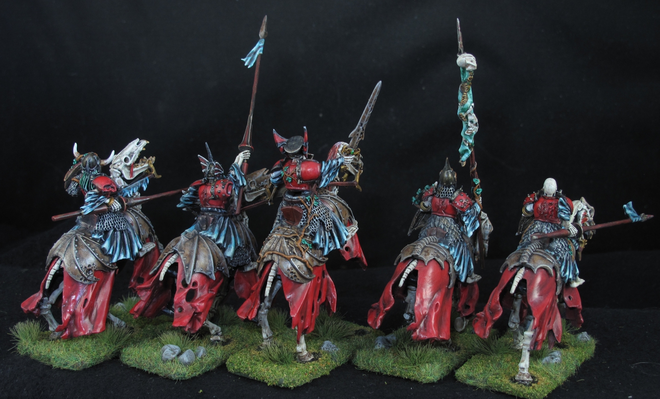
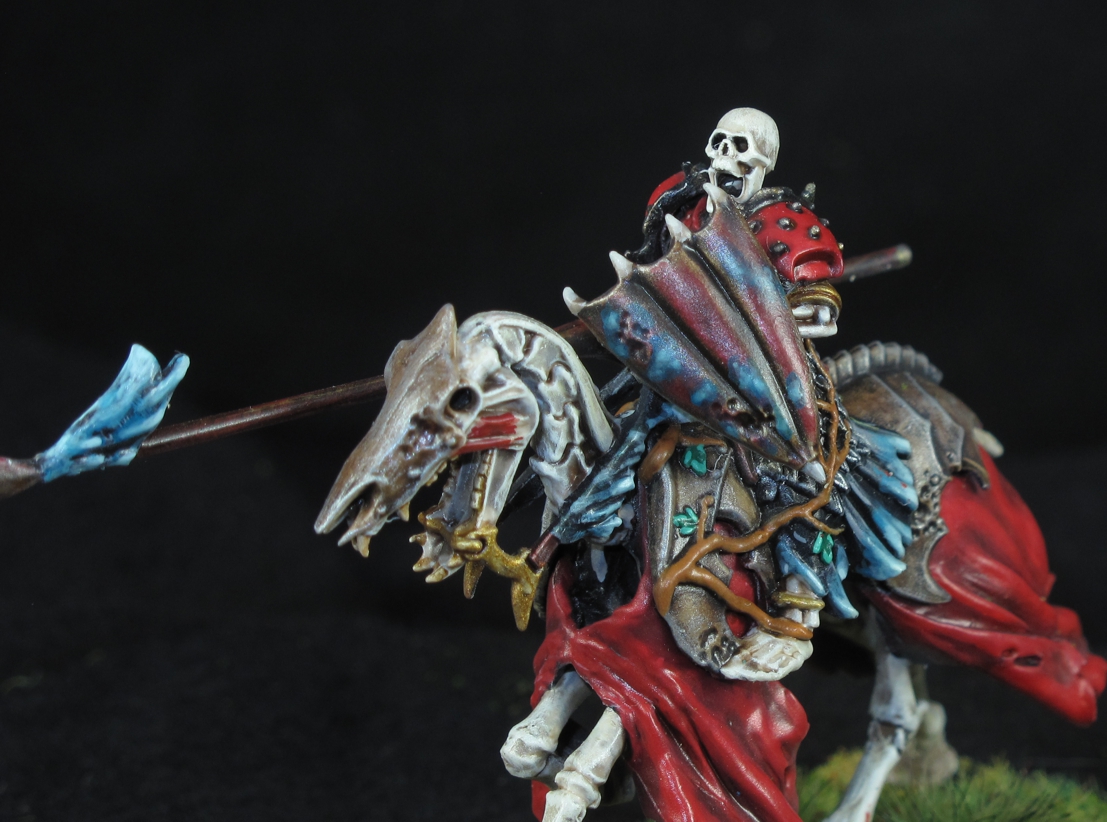
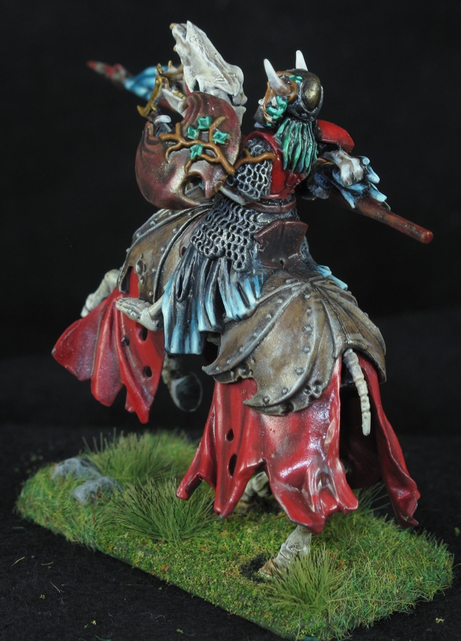
The opposite side of the previous figure. The sculptor has vines growing on various parts of the figures, something that at first I was not a fan of and almost tried to grind it off. Coming to my senses I went with it and now very much like the effect of something that came out of the ground.

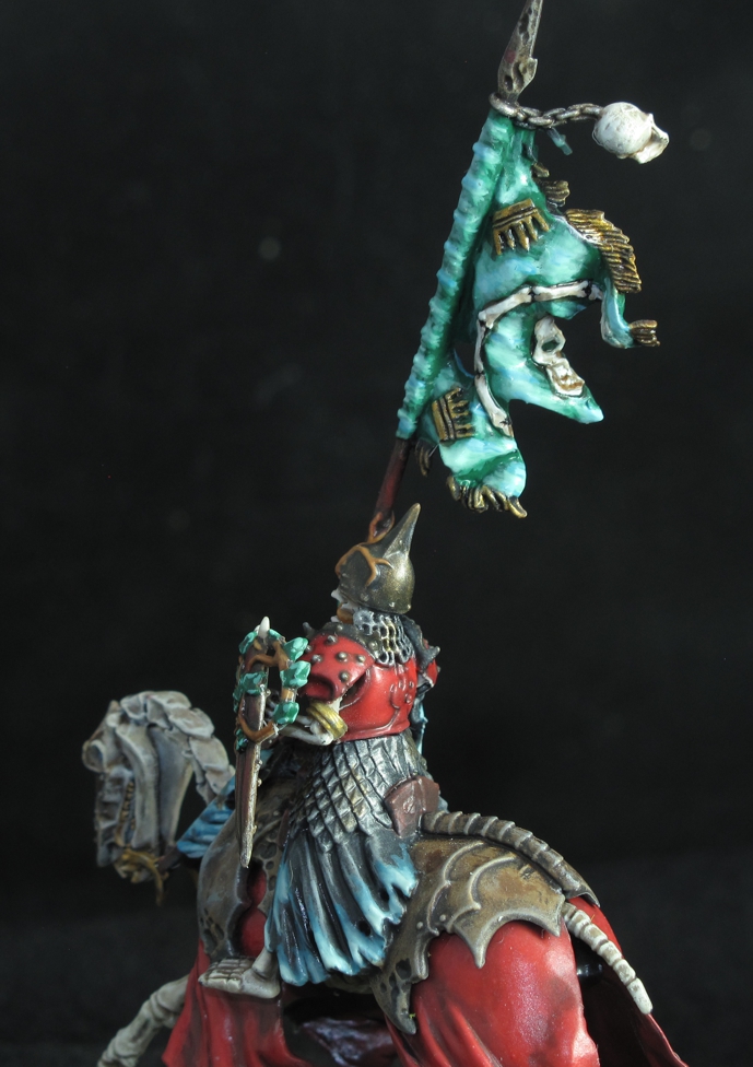
Normally I make my own banners out of other materials but I decided to go with the one provided and once painted really liked it. I did it using the ethereal colors for a more ghostly magic effect. This figure had extensive vines growing all over the figure, shield, and out onto his lance. To me it gives the feeling that the earth is trying to drag the warrior back into the ground, prevented only by the magic of the sorcerer who raised them from the dead!

With this entire army my choice of very plain grass and rock bases was deliberate to not draw attention away from the figures. I have seen some very nice army’s where this happens. Basing should be complimentary but not over powering to the figure. The green grass here creates a nice contrast in color and “living” verse “un-dead” look. The effect of dead/burned grass where the figure touches the ground was also used here to show the life force being sucked out of living things and used to give temporary “life” to the un-dead. The effect can be seen in some of the shots above.


On this figure you can see more of the sculptors use of vines and how it does work. These cross from his torso to the shield and also wrap around into his mouth.

This was another one of the mounts I altered from a lower galloping pose to a semi-rearing stance often seen as a horse rears upon impact with an opposing battle line! The horses head was also slightly altered to enhance the effect.

I hope you like this episode of the “Secret Warband” project and please leave a comment if you do as that motivates us to do more. Oh and before I sign off an important note! Plastic figures may not fair well in heat and most people don’t realize how hot the inside of your car or storage unit can get! different manufactures use different blends of plastic and some sagging and deformation can happen! Even just leaving your box in the sun for long periods can do it. High heat can also affect paint, fading it over time! Take care of your investment and enjoy them for a long time…cheers!